Client
Client
Sun Nutrafoods
Sun Nutrafoods
Agency
Agency
Studio Manasi Doshi
Studio Manasi Doshi
Year
Year
2025
2025
Role
Role
Print Design, Art Direction
Print Design, Art Direction
The Brief
Sun Nutrafoods came to us at a critical point in their growth.
As a B2B nutraceutical company focused on plant-based protein ingredients, they were preparing to showcase at global exhibitions in Paris, Frankfurt and Thailand. These weren’t just events. They were opportunities to build credibility with international buyers and partners.
They needed more than a booth. They needed a presence that felt serious, clear and trustworthy in a highly competitive space.
The Challenge
Plant-based and nutraceutical categories often fall into a pattern. Either overly clinical or overly generic. For a B2B audience, both can fall short.
In conversations with the Sun Nutrafoods team, we aligned on what really mattered. Design had to communicate scientific credibility, while still being strong enough to stand out in a busy exhibition environment.
It wasn’t about adding more. It was about nailing it right.
Our Approach
We treated this as a perception problem.For a brand in plant-based protein, design plays a critical role in building trust. It needs to feel grounded, structured and confident.
We chose to keep the language clean and intentional. No unnecessary elements, no exaggerated claims. Just clarity and focus.
At the same time, we ensured the brand had enough presence to draw attention in large-scale exhibition spaces.
Working closely with their team, we translated their core values of clean nutrition, innovation and reliability into a system that could extend across space and communication.
The Process
We started with their booths.
Using detailed 3D renders and walkthroughs, we mapped how the space would be seen and used. From first glance to close interaction, every touchpoint was considered.
Design language stayed minimal. Clean lines, controlled color and friendly, compelling graphics helped create a space that felt structured and credible. Lighting and layout were planned to highlight products and enable easy conversations.
Functionality played a key role. Booths were designed to handle high footfall while still allowing focused discussions with buyers and distributors, by showcasing the brand’s key products and their use.


Alongside this, we developed supporting collaterals.
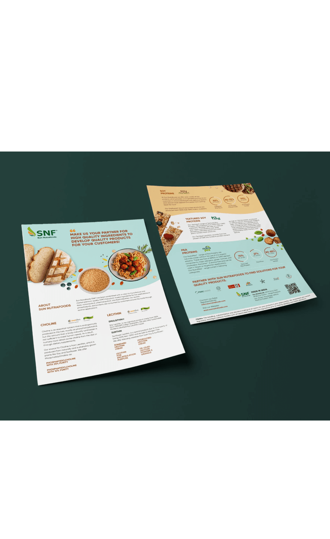
Company profiles, product brochures and presentations were designed with strong hierarchy and clear information flow. Complex details were broken down into formats that felt easy to navigate and understand. Everything worked together as one system.


Impact
What we created is a presence that feels confident without being loud.
Sun Nutrafoods stands out for the right reasons. Clear communication, strong structure and a sense of credibility that builds trust quickly.
Across exhibitions, this translated into better engagement and more meaningful conversations. Our design solutions positioned them as a serious player in the global plant-based nutraceutical industry.
The Brief
Sun Nutrafoods came to us at a critical point in their growth.
As a B2B nutraceutical company focused on plant-based protein ingredients, they were preparing to showcase at global exhibitions in Paris, Frankfurt and Thailand. These weren’t just events. They were opportunities to build credibility with international buyers and partners.
They needed more than a booth. They needed a presence that felt serious, clear and trustworthy in a highly competitive space.
The Challenge
Plant-based and nutraceutical categories often fall into a pattern. Either overly clinical or overly generic. For a B2B audience, both can fall short.
In conversations with the Sun Nutrafoods team, we aligned on what really mattered. Design had to communicate scientific credibility, while still being strong enough to stand out in a busy exhibition environment.
It wasn’t about adding more. It was about nailing it right.
Our Approach
We treated this as a perception problem.For a brand in plant-based protein, design plays a critical role in building trust. It needs to feel grounded, structured and confident.
We chose to keep the language clean and intentional. No unnecessary elements, no exaggerated claims. Just clarity and focus.
At the same time, we ensured the brand had enough presence to draw attention in large-scale exhibition spaces.
Working closely with their team, we translated their core values of clean nutrition, innovation and reliability into a system that could extend across space and communication.
The Process
We started with their booths.
Using detailed 3D renders and walkthroughs, we mapped how the space would be seen and used. From first glance to close interaction, every touchpoint was considered.
Design language stayed minimal. Clean lines, controlled color and friendly, compelling graphics helped create a space that felt structured and credible. Lighting and layout were planned to highlight products and enable easy conversations.
Functionality played a key role. Booths were designed to handle high footfall while still allowing focused discussions with buyers and distributors, by showcasing the brand’s key products and their use.
Alongside this, we developed supporting collaterals.
Company profiles, product brochures and presentations were designed with strong hierarchy and clear information flow. Complex details were broken down into formats that felt easy to navigate and understand. Everything worked together as one system.
Impact
What we created is a presence that feels confident without being loud.
Sun Nutrafoods stands out for the right reasons. Clear communication, strong structure and a sense of credibility that builds trust quickly.
Across exhibitions, this translated into better engagement and more meaningful conversations. Our design solutions positioned them as a serious player in the global plant-based nutraceutical industry.
More Projects
More Projects
More Projects


Contact us
We love working with businesses of all shapes and sizes.
or write to us at enquire@manasidoshi.com



Contact us
We love working with businesses of all shapes and sizes.
or write to us at enquire@manasidoshi.com
Contact us
We love working with businesses of all shapes and sizes.
or write to us at enquire@manasidoshi.com