Client
Client
Apeksha and Jincy
Apeksha and Jincy
Agency
Agency
-
-
Year
Year
2024
2024
Role
Role
Art Direction and Packaging Design
Art Direction and Packaging Design
The Brief
During the pandemic, founders Apeksha and Jincy turned home experiments into Savon - a direct-to-consumer brand of premium, artisanal bathing products. Handmade in small batches, personally tested for safety across all ages and genders, Savon offers indulgent yet accessible soap bars, scrubs, and more that give a luxurious, relaxing bathing experience, via exhibitions and made-to-order sales. For founders bootstrapping a DTC brand, the goal was packaging that captivates as the first touchpoint, building trust and premium perception from unboxing to use.
The Value Proposition
Savon’s Soap bars were hand-made, tested with unique combinations that address real skin problems on a daily basis. They are child-friendly, and have a range of special fragrances like musk and charcoal for men. Given the purity of ingredients, they are made in small-batches, with precision and perfection, for an ultimate, relaxing bath at the end of a tiring day.
Challenge
In a crowded handmade goods market, Savon's packaging needed to transcend basic wrapping. It had to embody the brand's ethos - natural care as everyday luxury - while echoing their ornate, earthy green logo. Key hurdles: Create an elegant, scalable system for current soap bars/scrubs and future expansions (body washes, lotions), ensure legibility for DTC appeal, and deliver a "grounded yet premium" feel that resonates with conscious consumers seeking authenticity.
The Brief
During the pandemic, founders Apeksha and Jincy turned home experiments into Savon - a direct-to-consumer brand of premium, artisanal bathing products. Handmade in small batches, personally tested for safety across all ages and genders, Savon offers indulgent yet accessible soap bars, scrubs, and more that give a luxurious, relaxing bathing experience, via exhibitions and made-to-order sales. For founders bootstrapping a DTC brand, the goal was packaging that captivates as the first touchpoint, building trust and premium perception from unboxing to use.
The Value Proposition
Savon’s Soap bars were hand-made, tested with unique combinations that address real skin problems on a daily basis. They are child-friendly, and have a range of special fragrances like musk and charcoal for men. Given the purity of ingredients, they are made in small-batches, with precision and perfection, for an ultimate, relaxing bath at the end of a tiring day.
Challenge
In a crowded handmade goods market, Savon's packaging needed to transcend basic wrapping. It had to embody the brand's ethos - natural care as everyday luxury - while echoing their ornate, earthy green logo. Key hurdles: Create an elegant, scalable system for current soap bars/scrubs and future expansions (body washes, lotions), ensure legibility for DTC appeal, and deliver a "grounded yet premium" feel that resonates with conscious consumers seeking authenticity.
Process
We dove deep into Savon's origin story, collaborating closely with Apeksha and Jincy to build a visual system that scales effortlessly for DTC growth.
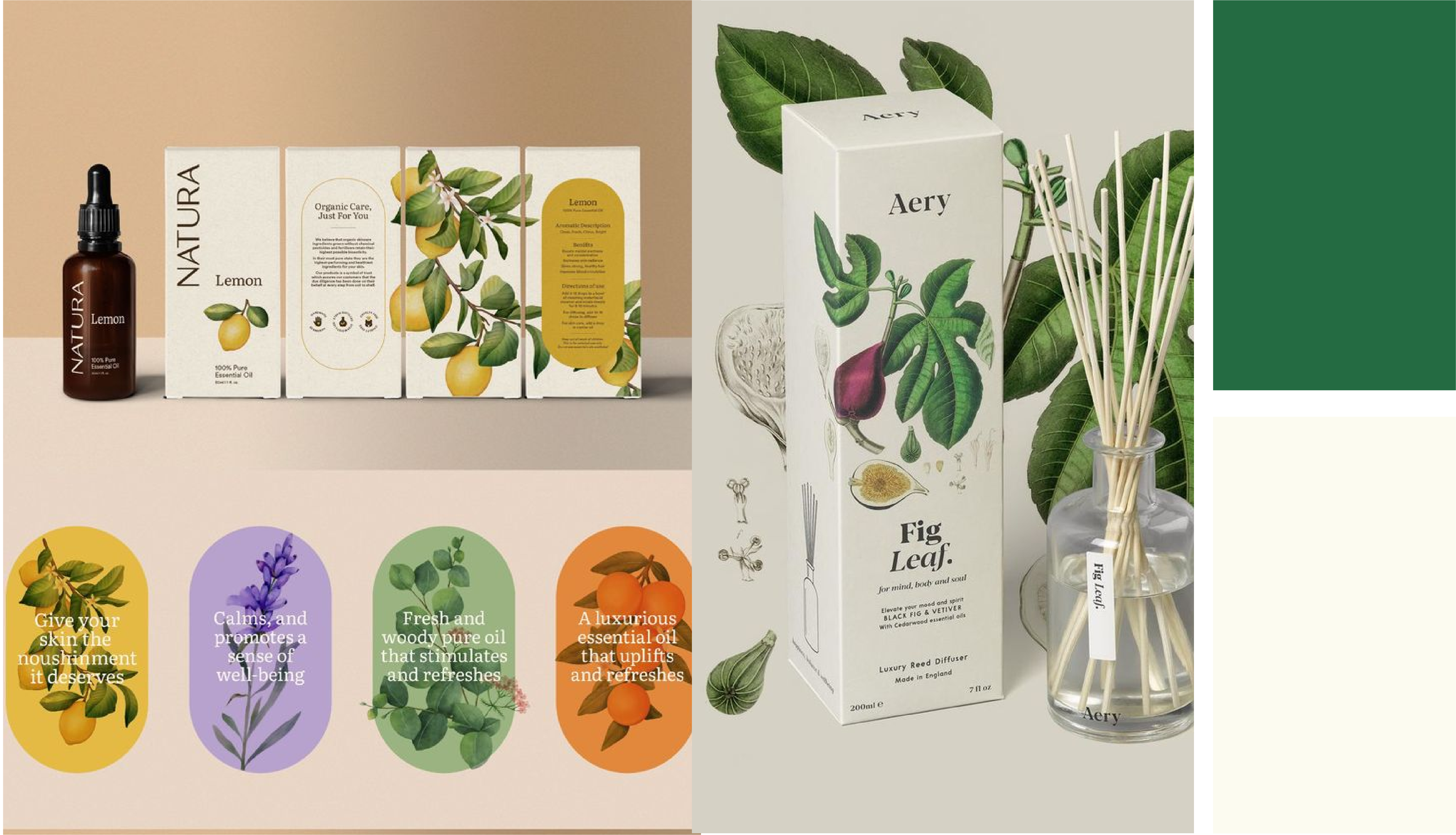
Moodboarding and Visual Foundation: Started with immersive moodboards pulling from their logo's ornate-yet-grounded vibe. Curated natural hues (earthy greens, soft neutrals, warm accents) and a refined palette to mirror simplicity, authenticity, and skin-nourishing ingredients.
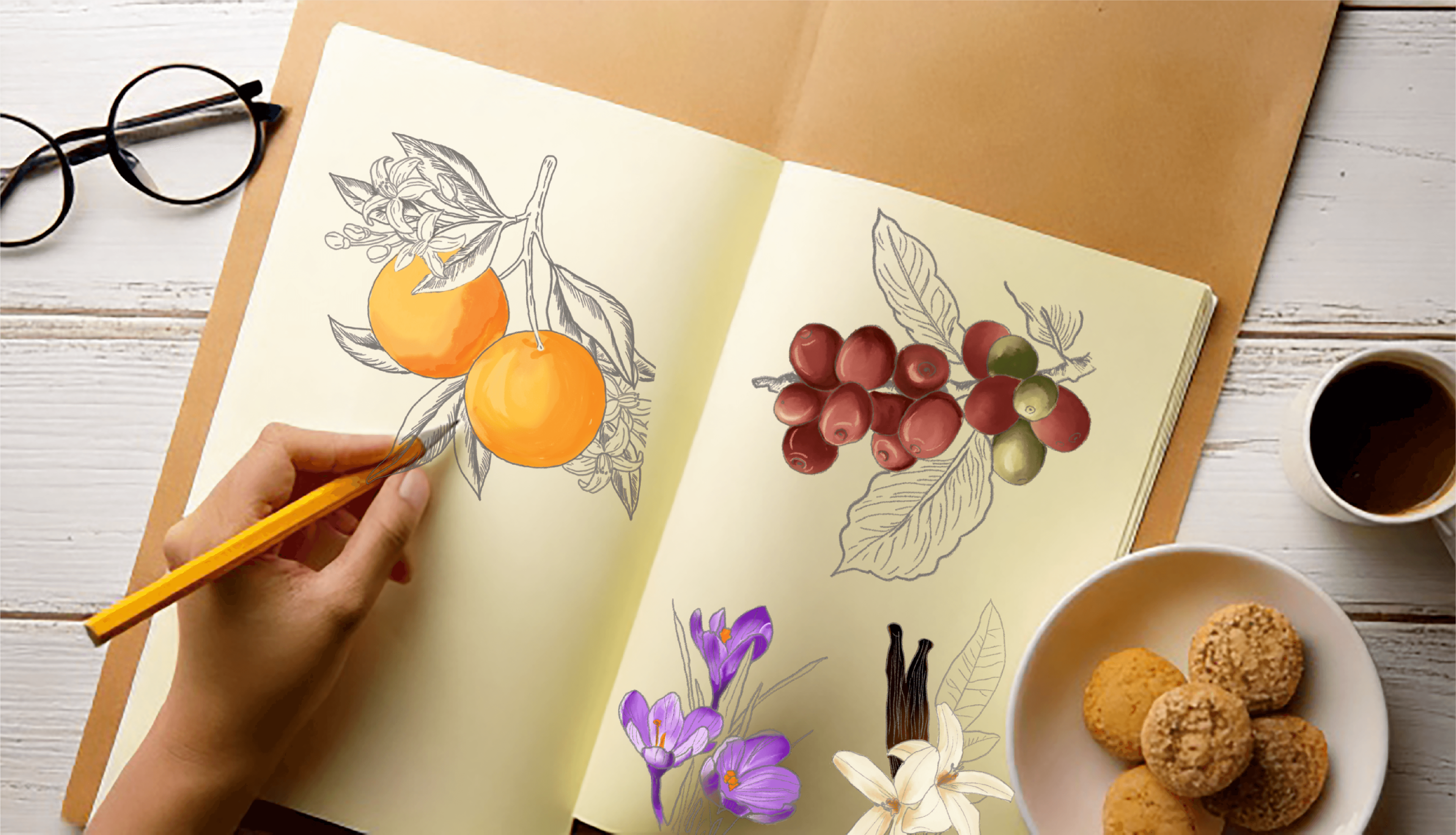
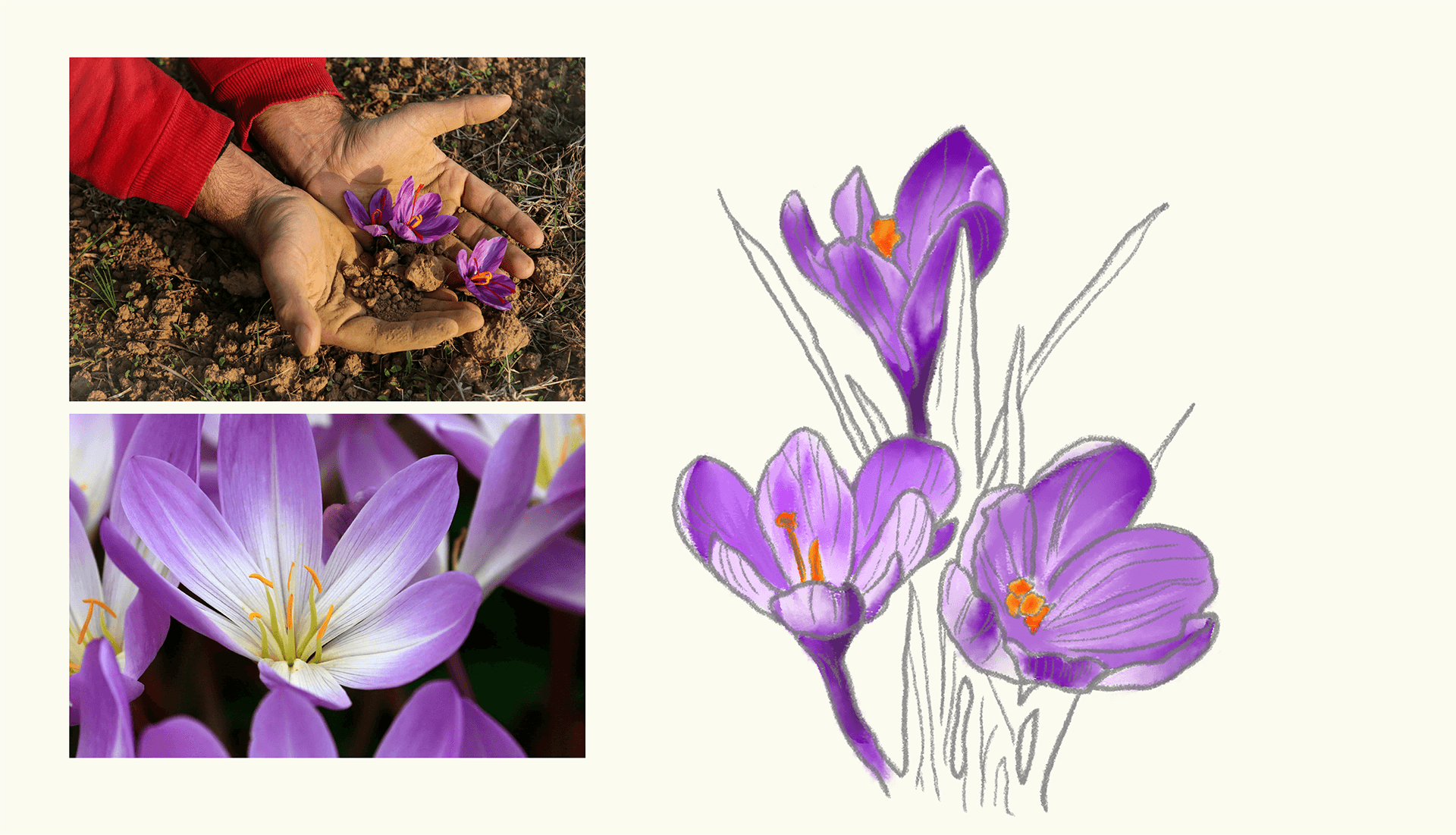
Hand drawn Illustrations of key Ingredients: Created bespoke, delicate hand drawn illustrations of key ingredients (e.g., orange, vanilla, chocolate, saffron, aleovera ). They were sketched with subtle texture and organic lines to evoke handmade craftsmanship. Placed strategically on labels, their minimalism and attention to detail add warmth without overwhelming the design, while feeling elevated and exclusive on the shelf.
Typography for Clarity and Scalability: We chose Object Sans - a clean, confident sans-serif - for all body text. Its legibility shines across product sizes (from compact soap bars to larger jars), ensuring ingredient lists, usage instructions, and branding read effortlessly at a glance. Paired with subtle hierarchy, it lets illustrations and colors breathe, creating a system that adapts seamlessly to new skincare lines like lotions or body washes - no redesigns needed.

Typography for Clarity and Scalability: We chose Object Sans - a clean, confident sans-serif - for all body text. Its legibility shines across product sizes (from compact soap bars to larger jars), ensuring ingredient lists, usage instructions, and branding read effortlessly at a glance. Paired with subtle hierarchy, it lets illustrations and colors breathe, creating a system that adapts seamlessly to new skincare lines like lotions or body washes - no redesigns needed.
Process
We dove deep into Savon's origin story, collaborating closely with Apeksha and Jincy to build a visual system that scales effortlessly for DTC growth.
Moodboarding and Visual Foundation: Started with immersive moodboards pulling from their logo's ornate-yet-grounded vibe. Curated natural hues (earthy greens, soft neutrals, warm accents) and a refined palette to mirror simplicity, authenticity, and skin-nourishing ingredients.
Hand drawn Illustrations of key Ingredients: Created bespoke, delicate hand drawn illustrations of key ingredients (e.g., orange, vanilla, chocolate, saffron, aleovera ). They were sketched with subtle texture and organic lines to evoke handmade craftsmanship. Placed strategically on labels, their minimalism and attention to detail add warmth without overwhelming the design, while feeling elevated and exclusive on the shelf.
Typography for Clarity and Scalability: We chose Object Sans - a clean, confident sans-serif - for all body text. Its legibility shines across product sizes (from compact soap bars to larger jars), ensuring ingredient lists, usage instructions, and branding read effortlessly at a glance. Paired with subtle hierarchy, it lets illustrations and colors breathe, creating a system that adapts seamlessly to new skincare lines like lotions or body washes - no redesigns needed.
Typography for Clarity and Scalability: We chose Object Sans - a clean, confident sans-serif - for all body text. Its legibility shines across product sizes (from compact soap bars to larger jars), ensuring ingredient lists, usage instructions, and branding read effortlessly at a glance. Paired with subtle hierarchy, it lets illustrations and colors breathe, creating a system that adapts seamlessly to new skincare lines like lotions or body washes - no redesigns needed.


Scalable Systems: Prototyped a flexible template launched with core products, tested for print scalability, and iterated based on founders' feedback.
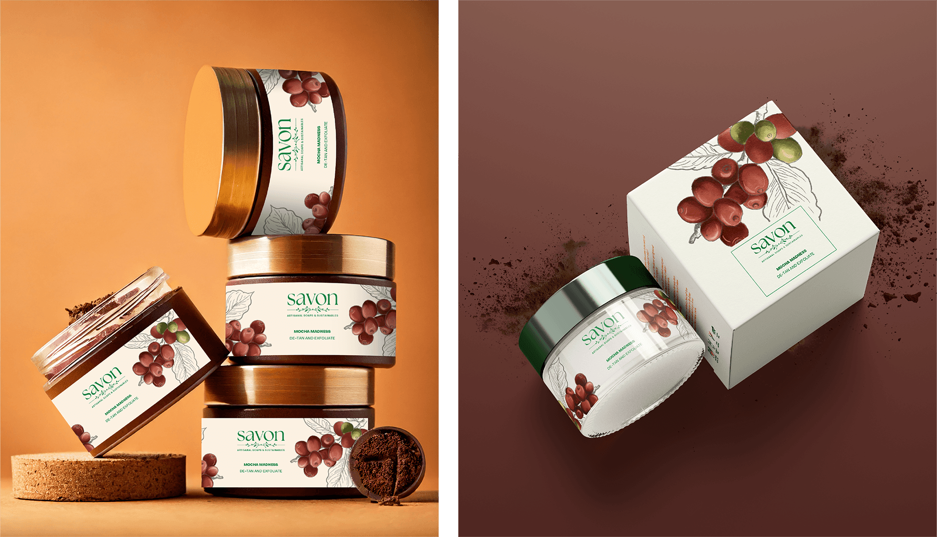

Result A plug-and-play framework with easy to adapt visuals for packaging as they add variants, and shines through.
Scalable Systems: Prototyped a flexible template launched with core products, tested for print scalability, and iterated based on founders' feedback.
Result A plug-and-play framework with easy to adapt visuals for packaging as they add variants, and shines through.
Impact Savon's packaging evokes luxury and minimalism - cohesive, restrained and DTC-ready. Founders reported stronger first impressions at exhibitions, higher perceived value in made-to-order sales, and easy onboarding for new products. Every bar or jar feels as indulgent as the care behind it, turning curious home experiments into a scalable brand story that connects with customers seeking mindful luxury.
Impact Savon's packaging evokes luxury and minimalism - cohesive, restrained and DTC-ready. Founders reported stronger first impressions at exhibitions, higher perceived value in made-to-order sales, and easy onboarding for new products. Every bar or jar feels as indulgent as the care behind it, turning curious home experiments into a scalable brand story that connects with customers seeking mindful luxury.
More Projects
More Projects
More Projects


Contact us
We love working with businesses of all shapes and sizes.
or write to us at enquire@manasidoshi.com



Contact us
We love working with businesses of all shapes and sizes.
or write to us at enquire@manasidoshi.com
Contact us
We love working with businesses of all shapes and sizes.
or write to us at enquire@manasidoshi.com