Client
Client
Volstar Private Limited
Volstar Private Limited
Agency
Agency
Studio Manasi Doshi
Studio Manasi Doshi
Year
Year
2024
2024
Role
Role
Brand Identity, Art Direction, Print, Web Design
Brand Identity, Art Direction, Print, Web Design
When Volstar Private Limited approached us to build Vorde, they envisioned more than just a line of electrical appliances - they wanted a trusted Indian brand that reflected international quality, modern design, and everyday dependability.
They had the vision. We brought the brand to life.
The Challenge
The Indian home appliances market is crowded with big names like Havells, Voltas, and AO Smith. Through extensive brand research and market analysis, we discovered that consumers tend to associate international-sounding brands with superior quality — even when the product experience doesn’t always match.
That insight defined our opportunity:
Create an authentically Indian brand that feels global, looks premium, and delivers true reliability.
Our Approach
We built Vorde from the ground up - crafting a brand that balances innovation and approachability, technology and emotion.
Brand Strategy & Positioning
We defined Vorde’s core as “Thoughtful Innovation for Everyday Living” - a promise of performance wrapped in simplicity.


Brand Design & Visual Identity
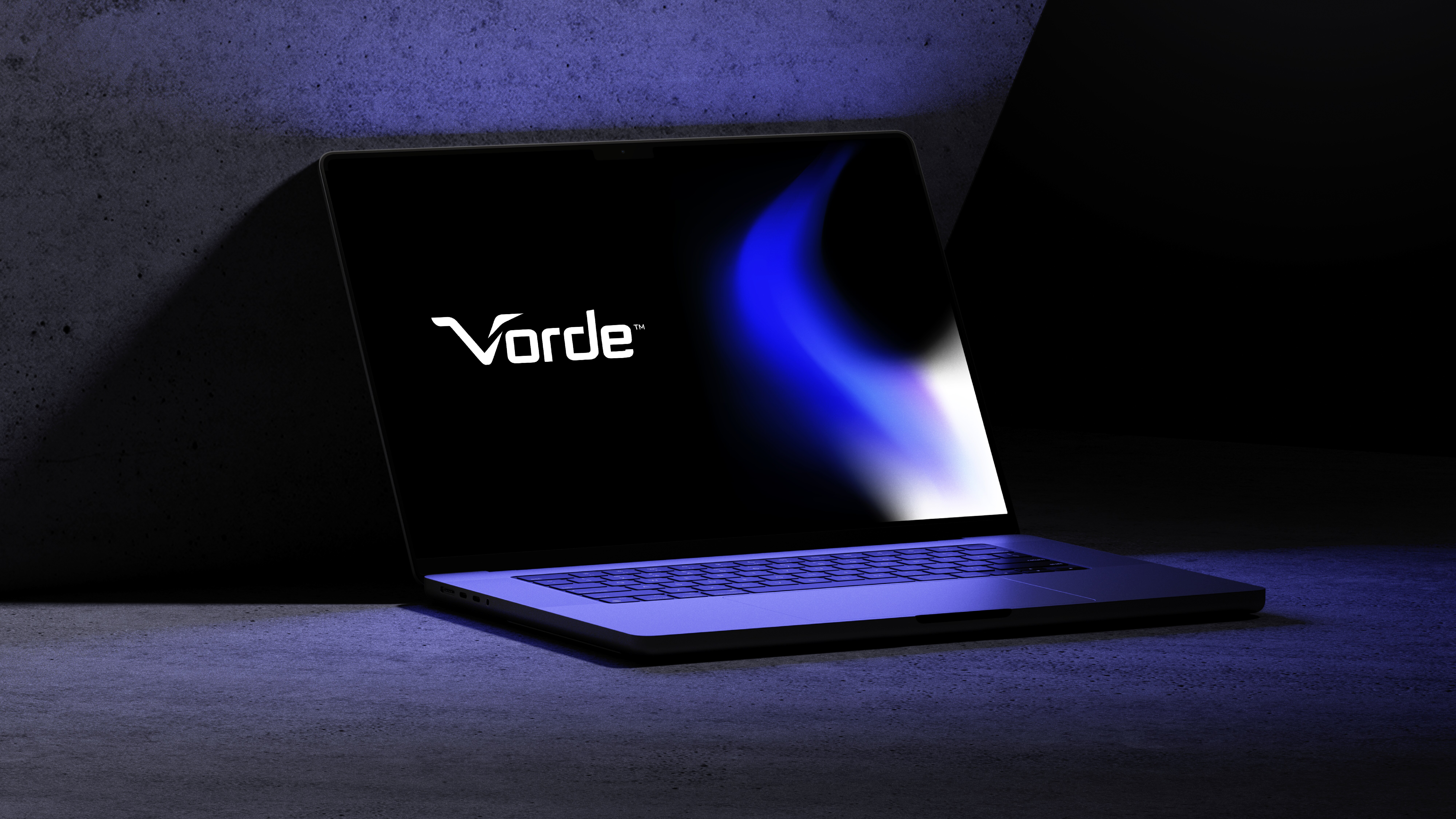
Breaking away from predictable reds and greys, we introduced a fresh palette of blue, black, and white - confident, modern, and distinct. A sleek grotesk typeface added a refined industrial aesthetic, while gradients and dynamic layouts brought energy and movement.


Storytelling Through Design
Our brand storytelling focused on efficiency and innovation: applications moments that show Vorde quietly improving life - be it in our daily lifestyle, or industrial applications.


Packaging & Collaterals
Minimal, sustainable, and purposeful — every piece of brand communication, from packaging to brochures, echoed Vorde’s clarity and trustworthiness.
When Volstar Private Limited approached us to build Vorde, they envisioned more than just a line of electrical appliances - they wanted a trusted Indian brand that reflected international quality, modern design, and everyday dependability.
They had the vision. We brought the brand to life.
The Challenge
The Indian home appliances market is crowded with big names like Havells, Voltas, and AO Smith. Through extensive brand research and market analysis, we discovered that consumers tend to associate international-sounding brands with superior quality — even when the product experience doesn’t always match.
That insight defined our opportunity:
Create an authentically Indian brand that feels global, looks premium, and delivers true reliability.
Our Approach
We built Vorde from the ground up - crafting a brand that balances innovation and approachability, technology and emotion.
Brand Strategy & Positioning
We defined Vorde’s core as “Thoughtful Innovation for Everyday Living” - a promise of performance wrapped in simplicity.
Brand Design & Visual Identity
Breaking away from predictable reds and greys, we introduced a fresh palette of blue, black, and white - confident, modern, and distinct. A sleek grotesk typeface added a refined industrial aesthetic, while gradients and dynamic layouts brought energy and movement.
Storytelling Through Design
Our brand storytelling focused on efficiency and innovation: applications moments that show Vorde quietly improving life - be it in our daily lifestyle, or industrial applications.
Packaging & Collaterals
Minimal, sustainable, and purposeful — every piece of brand communication, from packaging to brochures, echoed Vorde’s clarity and trustworthiness.


The Result
A future-ready brand system that gives Vorde a clear, scalable identity across digital and retail touchpoints.
Today, Vorde stands as a promising name in India’s electrical appliances sector - a brand defined by smart design, honest communication, and everyday reliability.
Read Complete Case Study
The Result
A future-ready brand system that gives Vorde a clear, scalable identity across digital and retail touchpoints.
Today, Vorde stands as a promising name in India’s electrical appliances sector - a brand defined by smart design, honest communication, and everyday reliability.
Read Complete Case Study
More Projects
More Projects
More Projects



Contact us
We love working with businesses of all shapes and sizes.
or write to us at enquire@manasidoshi.com



Contact us
We love working with businesses of all shapes and sizes.
or write to us at enquire@manasidoshi.com
Contact us
We love working with businesses of all shapes and sizes.
or write to us at enquire@manasidoshi.com