

Client
Client
Entios ai
Entios ai
Agency
Agency
Studio Manasi Doshi
Studio Manasi Doshi
Year
Year
2025
2025
Role
Role
Brand Strategy, Brand Identity
Brand Strategy, Brand Identity
The Brief
Entios.ai came to us as our first US-based client, at a point where something didn’t feel right.
They already had an identity, built using automated tools. On paper, it worked. But in practice, it wasn’t connecting. It didn’t reflect the ambition of the product or resonate with their audience.
In conversations with the team, one thing became clear. The brand felt generic, but the product clearly wasn’t. Entios.ai is an agentic AI platform built to automate marketing systems and surveys, freeing up human thinking for decisions, strategy and creativity.
The ask was to build a brand that could reflect this shift. From automation for inspiration.
The Challenge
AI brands often fall into a pattern.
Cold, overly technical or visually indistinguishable from each other. For a product built to enable creativity, that direction would fall short.
We needed to move away from predictable AI cues and build something that felt energizing, intuitive and forward-looking.
At the same time, it had to hold credibility. This wasn’t a conceptual product. It was a working system designed for marketers and decision-makers.
In discussions with the team, we aligned on a key idea. The brand should not just explain what the product does. It should reflect what it enables.
Our Approach
We started with the name.
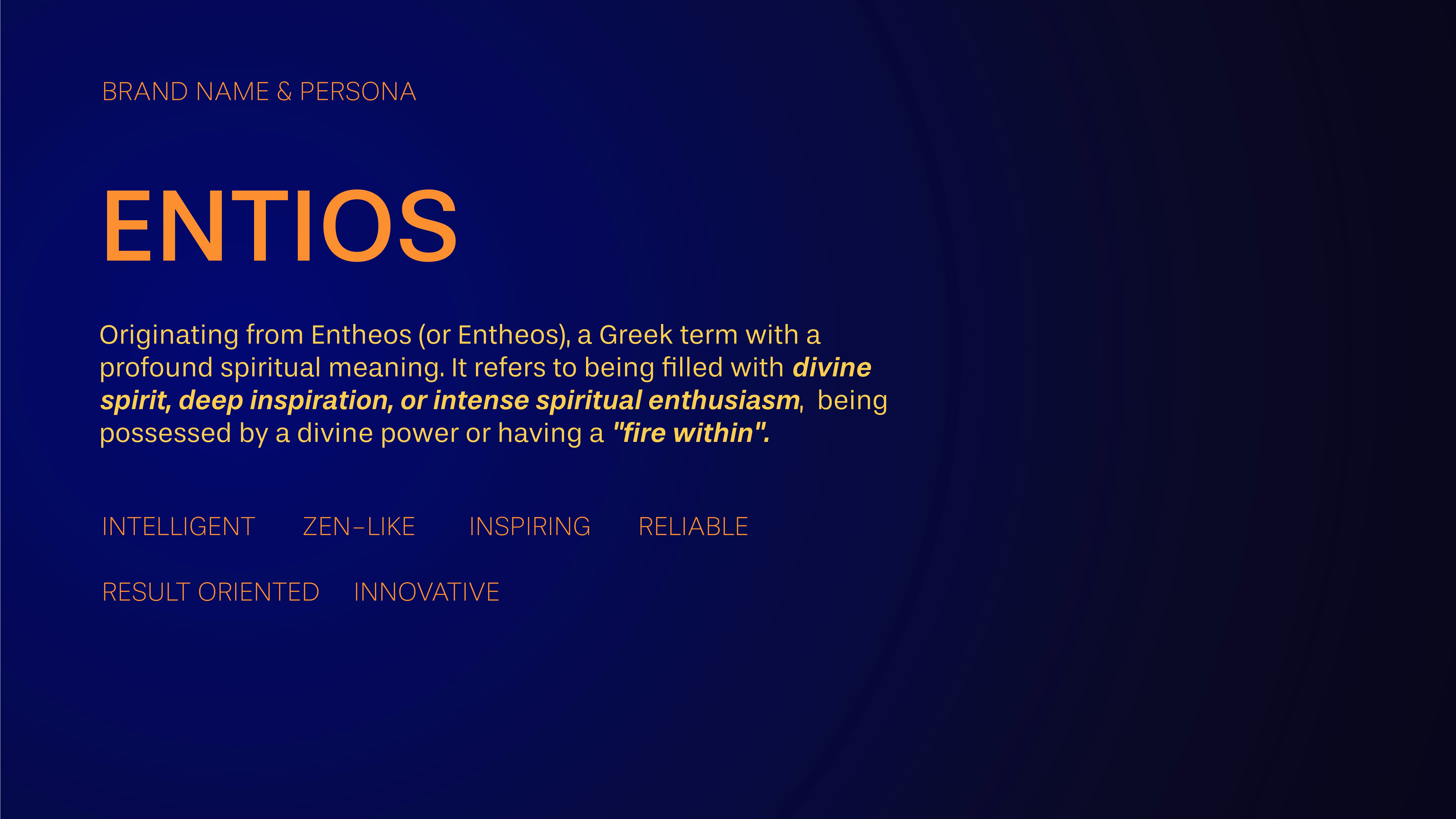
Entios carries a strong meaning. Inspiration and divine power. That became our anchor.
Instead of focusing on automation, we focused on outcome. What happens when systems take over repetitive work. More clarity. More creativity. More breakthrough thinking.
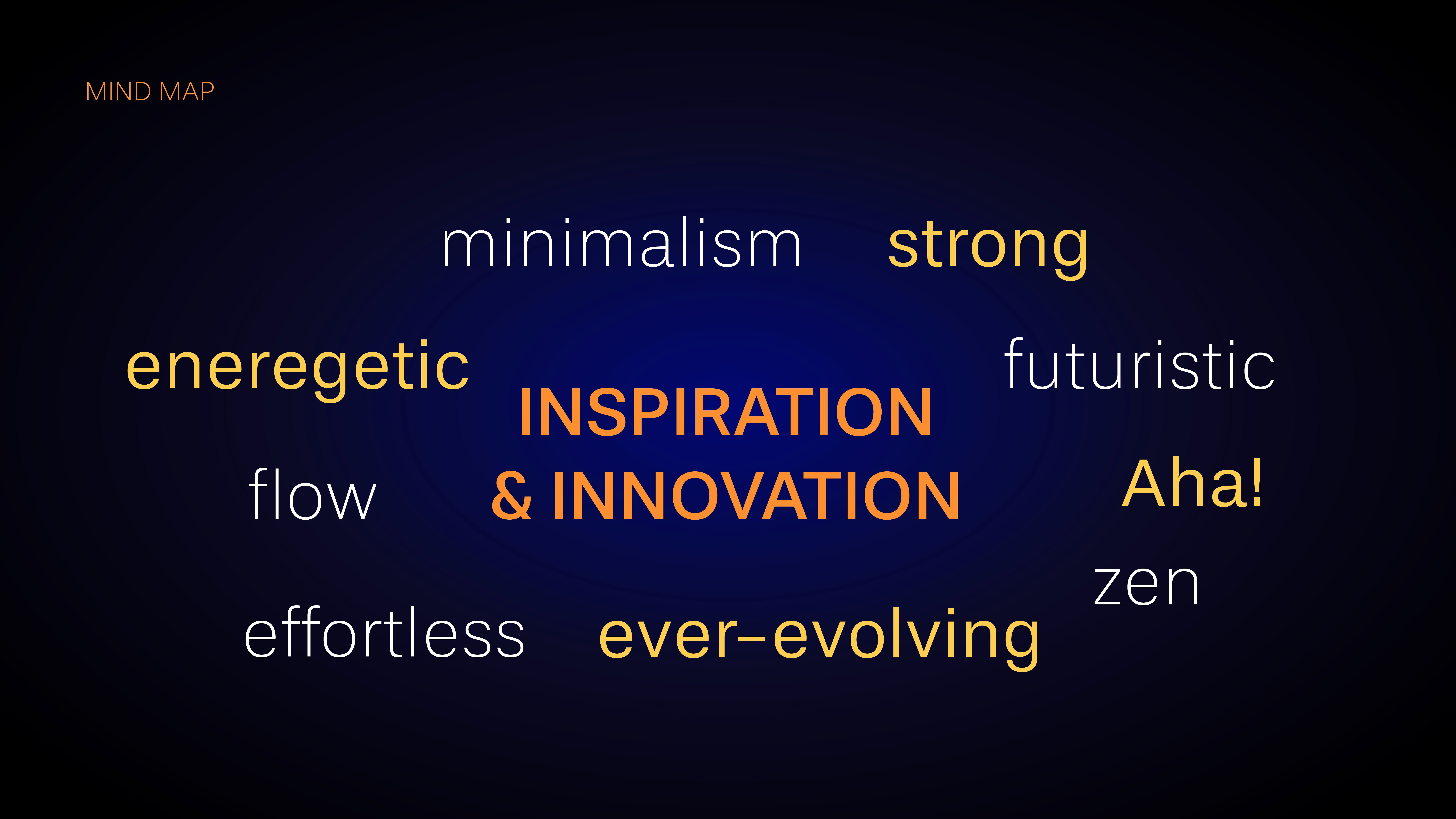
We defined the brand persona as inspiring, energetic and creative. The kind of brand that triggers an “aha” moment rather than overwhelming with information.
For visual inspiration, we kept coming back to the northern lights. Fluid, electric and constantly shifting, yet never chaotic. It felt like the right metaphor for an intelligent system working in the background while creating visible impact.
The Process
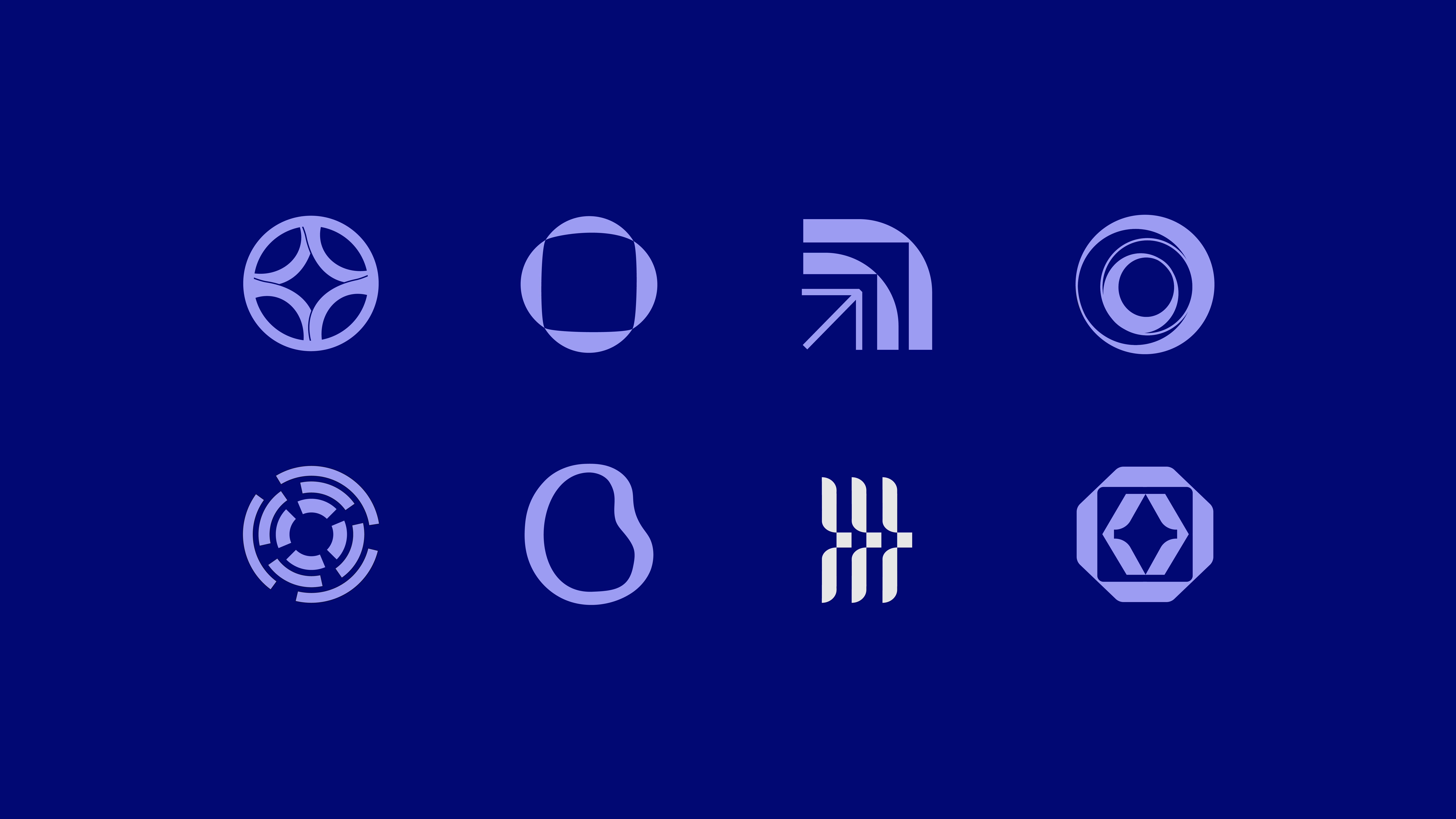
We built the identity around movement and intent.
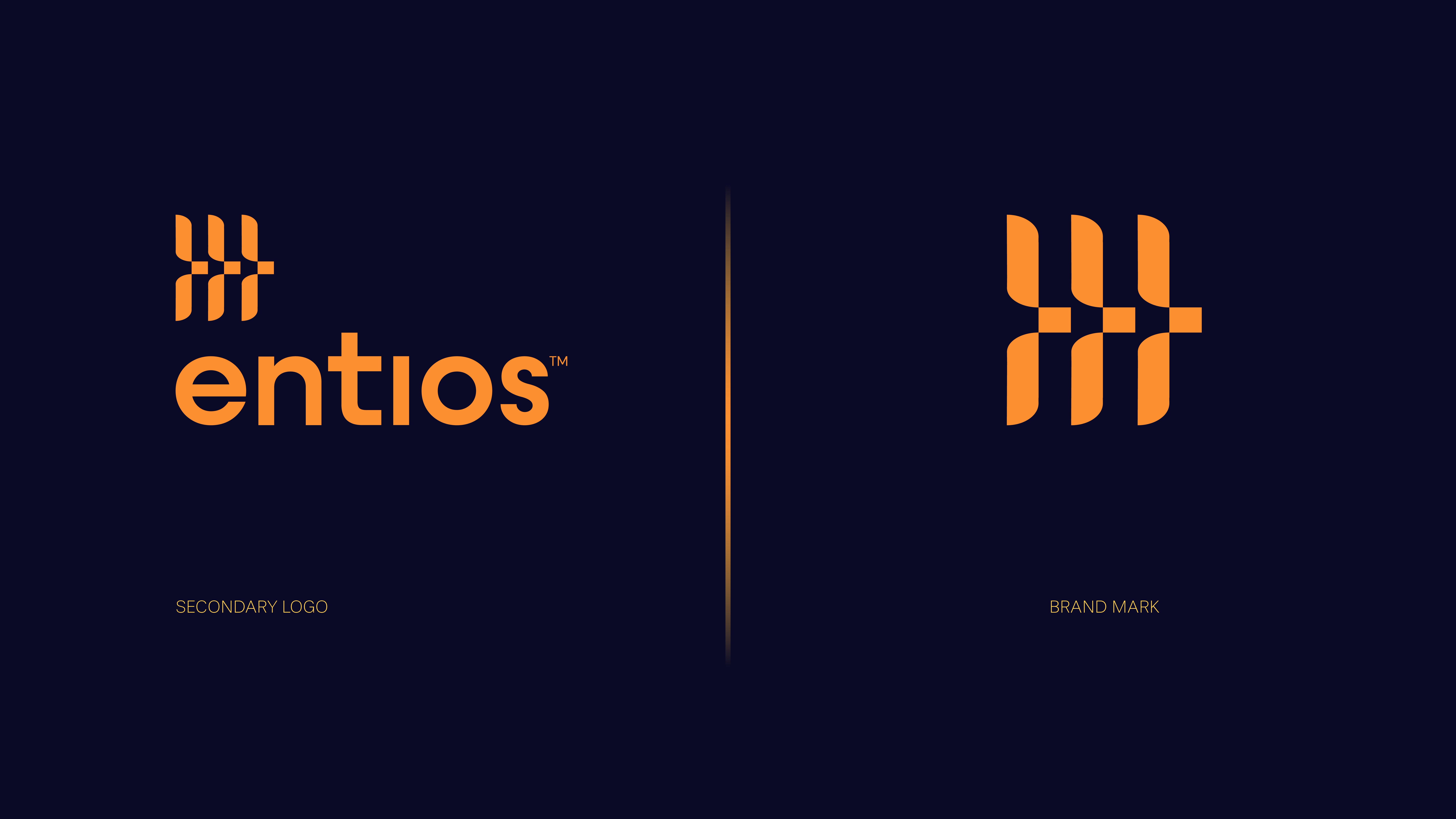
The logo draws from multiple cues. Wings to represent lift and possibility, and brackets from coding to anchor it in technology. Together, they create a form that feels dynamic and purposeful.
Color became a defining layer.
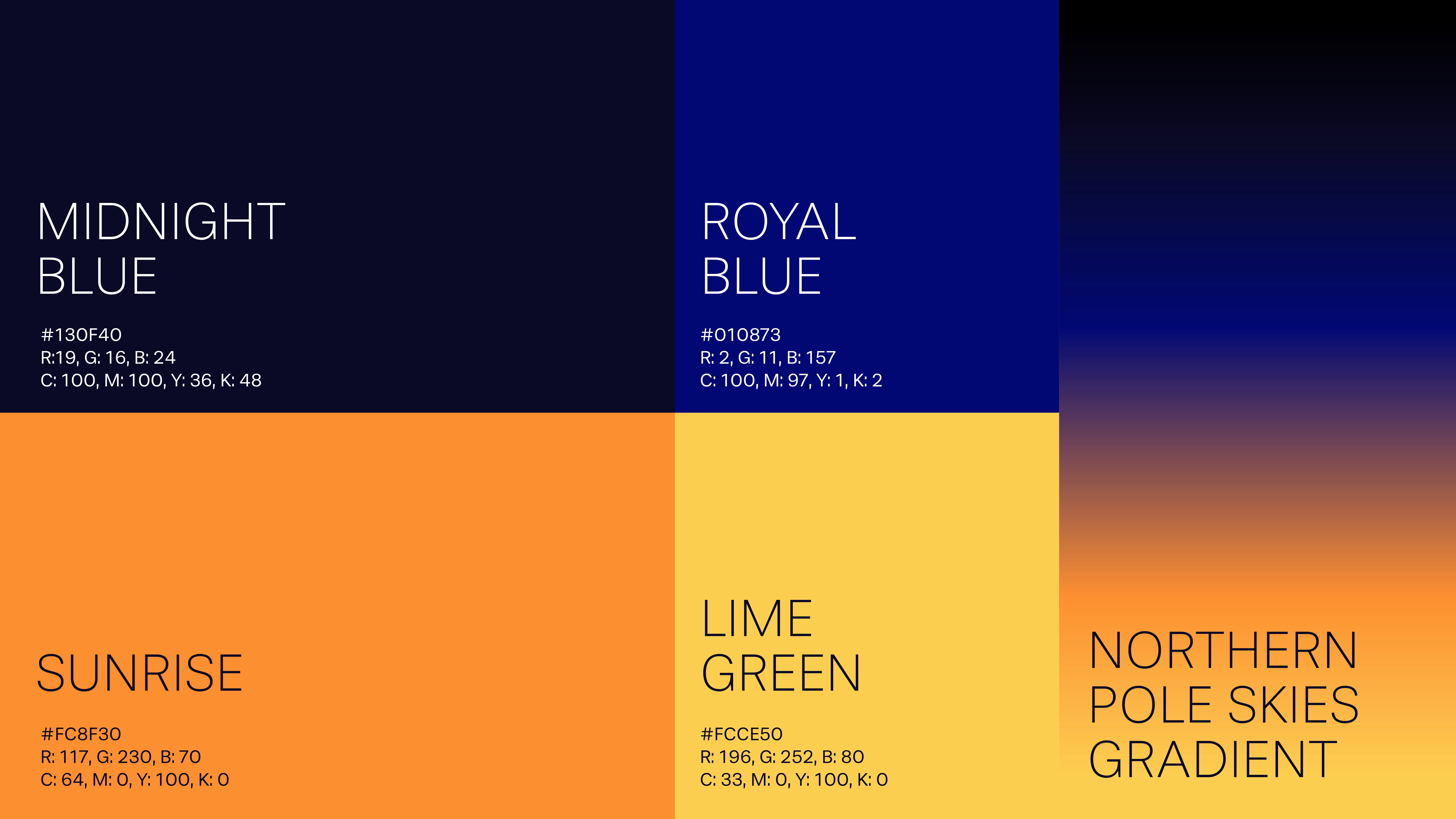
We developed a gradient system inspired by the idea of sunrise within night. Orange and yellow tones bring warmth and energy, while deep and electric blues add depth and technological clarity. Together, they create a sense of transition from system to spark.
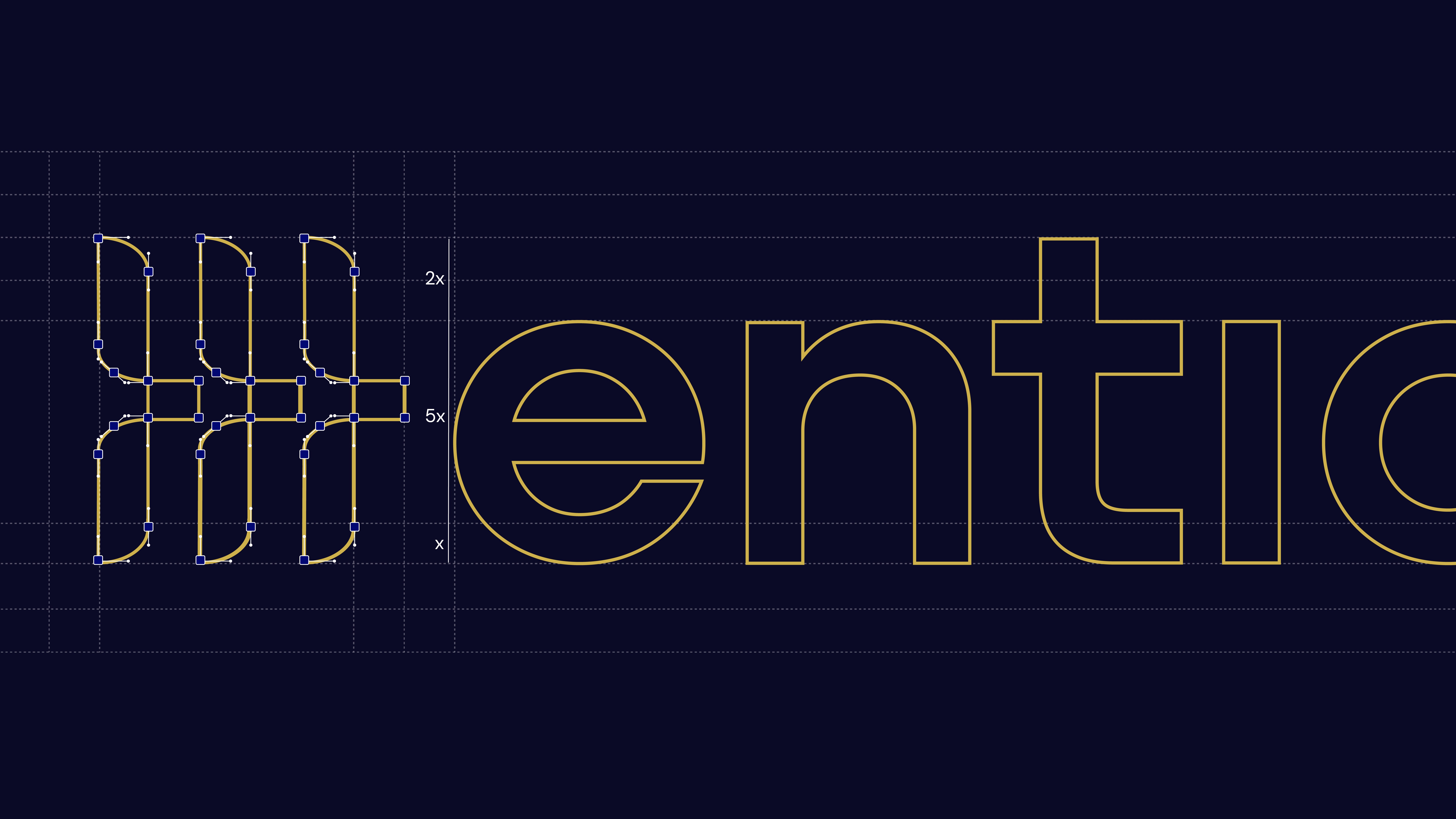
Across touchpoints, we kept communication sharp and minimal. No unnecessary noise. Just enough to guide, with space for ideas to land.
Every decision worked towards one goal. Make the brand feel alive, not mechanical
The Brief
Entios.ai came to us as our first US-based client, at a point where something didn’t feel right.
They already had an identity, built using automated tools. On paper, it worked. But in practice, it wasn’t connecting. It didn’t reflect the ambition of the product or resonate with their audience.
In conversations with the team, one thing became clear. The brand felt generic, but the product clearly wasn’t. Entios.ai is an agentic AI platform built to automate marketing systems and surveys, freeing up human thinking for decisions, strategy and creativity.
The ask was to build a brand that could reflect this shift. From automation for inspiration.
The Challenge
AI brands often fall into a pattern.
Cold, overly technical or visually indistinguishable from each other. For a product built to enable creativity, that direction would fall short.
We needed to move away from predictable AI cues and build something that felt energizing, intuitive and forward-looking.
At the same time, it had to hold credibility. This wasn’t a conceptual product. It was a working system designed for marketers and decision-makers.
In discussions with the team, we aligned on a key idea. The brand should not just explain what the product does. It should reflect what it enables.
Our Approach
We started with the name.
Entios carries a strong meaning. Inspiration and divine power. That became our anchor.
Instead of focusing on automation, we focused on outcome. What happens when systems take over repetitive work. More clarity. More creativity. More breakthrough thinking.
We defined the brand persona as inspiring, energetic and creative. The kind of brand that triggers an “aha” moment rather than overwhelming with information.
For visual inspiration, we kept coming back to the northern lights. Fluid, electric and constantly shifting, yet never chaotic. It felt like the right metaphor for an intelligent system working in the background while creating visible impact.
The Process
We built the identity around movement and intent.
The logo draws from multiple cues. Wings to represent lift and possibility, and brackets from coding to anchor it in technology. Together, they create a form that feels dynamic and purposeful.
Color became a defining layer.
We developed a gradient system inspired by the idea of sunrise within night. Orange and yellow tones bring warmth and energy, while deep and electric blues add depth and technological clarity. Together, they create a sense of transition from system to spark.
Across touchpoints, we kept communication sharp and minimal. No unnecessary noise. Just enough to guide, with space for ideas to land.
Every decision worked towards one goal. Make the brand feel alive, not mechanical


Impact
What we created is a brand that reflects what Entios.ai truly enables.
It moves away from generic AI positioning and presents itself as a tool for creative acceleration. Something that supports thinking, not replaces it.
The identity feels energetic, distinct and future-facing, while still holding structure and credibility.
More importantly, it aligns perception with product. Because Entios.ai is not just about automation. It is about using automation for inspiration.
More Projects
More Projects
More Projects


Contact us
We love working with businesses of all shapes and sizes.
or write to us at enquire@manasidoshi.com


Contact us
We love working with businesses of all shapes and sizes.
or write to us at enquire@manasidoshi.com
Contact us
We love working with businesses of all shapes and sizes.
or write to us at enquire@manasidoshi.com

