Client
Client
Mr. Towseef Wani
Mr. Towseef Wani
Agency
Agency
Year
Year
Role
Role
Brand strategy, brand identity, print & packaging, content writing
Brand strategy, brand identity, print & packaging, content writing
The Brief
Mr. Towseef Wani came to us with a resource, not yet a brand — Kashmiri saffron and shilajit of a quality that rarely leaves the valley it's grown in. His ambition was a scalable, premium D2C label built on dry fruits and spices sourced entirely from Kashmir, positioned against the overseas imports that dominate Indian shelves. The brief was simple to say and hard to do: make provenance the product.
Reading the Market Before Naming Anything
We started where every credible strategy starts — outside the brand, in the category it's about to enter. India's premium dry fruits and wellness foods market is headed toward ₹1.7 trillion by 2028, and the growth is disproportionately going to brands that can prove where their product comes from. That's the tell. Almonds are over 90% imported. Walnuts are 90% from Jammu & Kashmir but still under-branded at origin. Saffron carries a GI tag and rising global demand, yet most of what reaches consumers arrives without a story attached to it.
J&K, in other words, already has the credentials — over 90% of the country's walnuts, 95% of its almonds, effectively all its saffron. What it doesn't have is enough brands translating that dominance into desirability.
Where the Competitors Were Standing Still
We mapped the category in two clusters — nuts and dry fruits, and spices — against names like Nutraj, Happilo, Urban Platter, Rasayanam, and Kashmirica. The pattern across nearly all of them was the same: real quality, familiar language. "Premium." "Pure." "Healthy." Words doing a lot of work without doing much differentiation.
Four gaps stood out clearly enough to build a positioning on:
An untapped category combination. Brands treat dry fruits as snackable nutrition or spices as Ayurvedic wellness — almost none treat Kashmiri saffron and shilajit as parts of one origin story.
A missing traceability narrative. Few brands can actually show farm-to-shelf provenance for saffron or shilajit, despite it being the single strongest claim available to anyone who can prove it.
Premium claims without premium design. Plenty of brands say luxury. Very few brands' packaging and visual identity actually earn the word.
Thin homegrown authenticity messaging. GI-tagged, single-origin, Himalayan-specific storytelling is scarce — leaving room for a brand willing to go deeper on heritage than "sourced in India."
The Positioning: Valley to Table
The strategic territory we recommended blended five ideas into one coherent position — Kashmiri culture and traceable sourcing, a "Valley to Table" purity promise, packaging worthy of the word premium, environmental stewardship, and a wellness narrative rooted in Kashmir's climate rather than generic health claims. Underneath all of it sat a direct-to-consumer trust model — authenticity certificates, batch-level traceability, and real stories from the farmers and artisans behind the product, not stock imagery standing in for provenance.
Naming the Brand
Naming ran through five directions — Nectarfields, Puravera, Puritia, Alpine Treasure — each testing a different register of the same territory: purity, truth, refinement, altitude. Nectardale won because it did something the others didn't — it compressed the entire strategy into two syllables. Nectar, for the rarest, most concentrated form of something good. Dale, for the valley it comes from. The name doesn't describe the product. It describes the place the product is from, which is the whole point of the brand.
Building the Brand World
We built Nectardale's personality around a single figure: the Himalayan Connoisseur — sophisticated enough to sit alongside global wellness brands, but never disconnected from where it actually comes from. Five traits carried that persona through every downstream decision: a sophisticated world citizen, a cultural storyteller, a guardian of purity, an empowering steward of the farmers behind the product, and a wellness sophisticate who sells vitality rather than just nutrition.


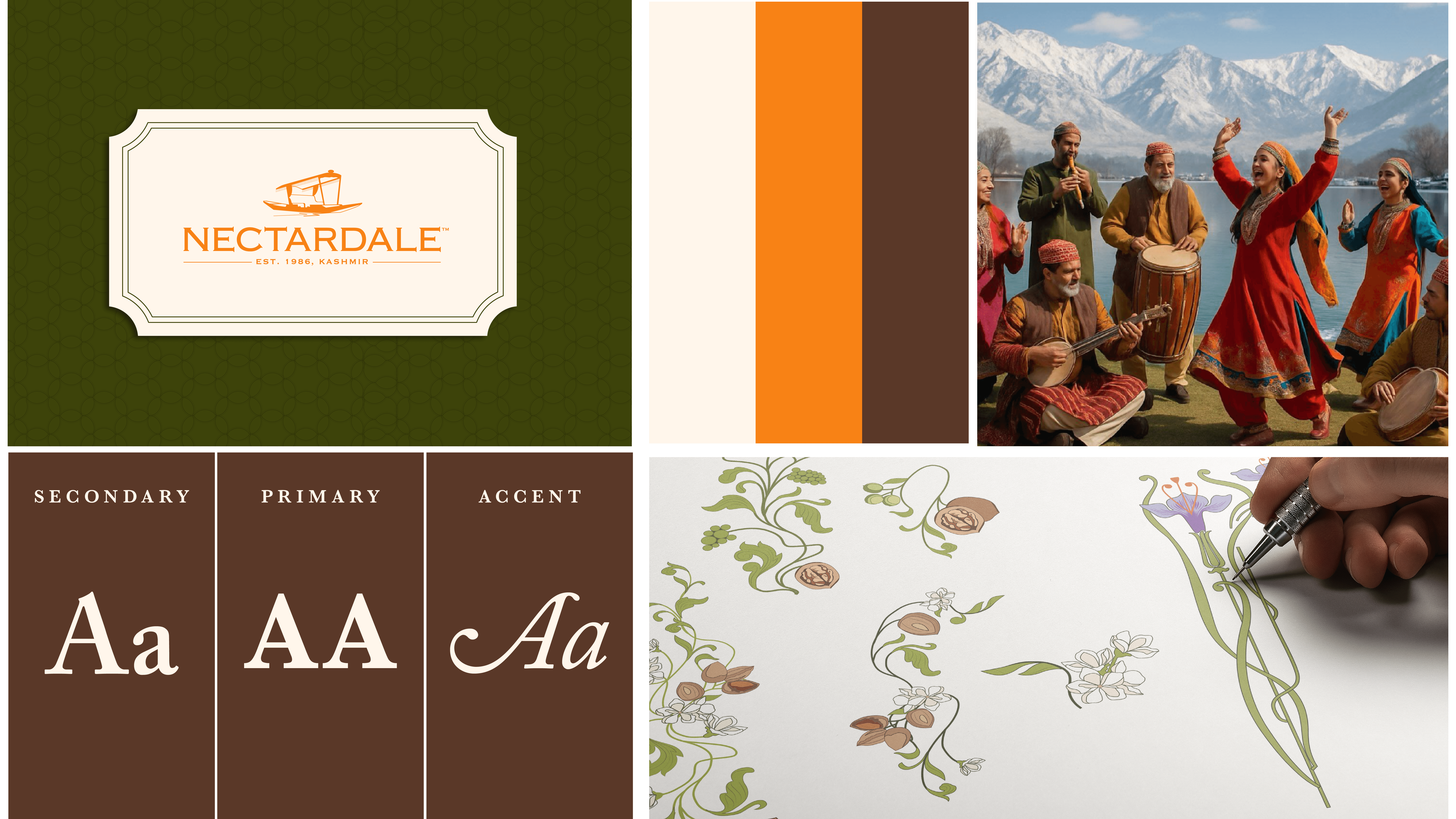
That personality needed a visual language that felt inherited rather than designed. The primary palette — Almond Cream, Saffron Blend, Walnut — reads like the product itself: warm, earthy, unmistakably sourced from something grown, not manufactured. Typography paired Baskerville Semibold for headers with Adobe Caslon Pro Italic as an accent — a combination that carries old-world credibility without tipping into costume-drama pastiche. Moodboards leaned into Kashmir's own imagery: orchard blossom, saffron fields, mountain light — so the brand's visual world and its origin story are, quite literally, the same photographs.
That system extended into stationery, seals, and digital touchpoints — proof that "premium" wasn't just a word in the positioning deck, but a standard the brand could hold at every size, from a business card to a product seal.
The Outcome
Nectardale now has what almost none of its competitors do: a name, a visual identity, and a strategic position that are all telling the same story from three different angles. Where the category defaults to generic premium language, Nectardale has a specific valley, a specific persona, and a specific claim — Kashmiri saffron and shilajit, traceable from source to shelf — that's genuinely difficult for an import-heavy competitor to copy.
Add images in the series as their number,.
SEO Meta Descriptions
Keyword-forward: Case study: brand strategy and naming for Nectardale, a premium D2C FMCG Kashmiri dry fruits and saffron brand built on origin transparency and traceability.
Insight-led: Most premium dry fruit brands claim purity. Nectardale is the rare one built to prove it — a Kashmiri origin story translated into name, positioning, and visual identity.
Audience-first: How we named and positioned Nectardale, a Himalayan saffron and dry fruits brand, for D2C shoppers who care where their premium ingredients actually come from.
LinkedIn Captions
Story-led: A client came to us with something most brands would kill for — dry fruits and saffron actually grown in Kashmir, not just packaged to sound like it. The problem wasn't the product. It was that nobody in the category was telling this story with any specificity.
So we didn't start with a name. We started with the market — where the imports were hiding, where the "premium" claims were empty, where traceability was a line in a deck instead of a real promise.
The name that came out the other end, Nectardale, compresses the whole strategy into two syllables: the rarest form of something good, from the valley it's actually from.
Full case study — link in comments.
Hook-driven: Every dry fruits brand in India says "premium." Almost none can prove where the product actually came from.
That gap became the entire strategy for Nectardale — a Kashmiri saffron and dry fruits brand we named, positioned, and built a visual identity for from the ground up.
The Brief
Mr. Towseef Wani came to us with a resource, not yet a brand — Kashmiri saffron and shilajit of a quality that rarely leaves the valley it's grown in. His ambition was a scalable, premium D2C label built on dry fruits and spices sourced entirely from Kashmir, positioned against the overseas imports that dominate Indian shelves. The brief was simple to say and hard to do: make provenance the product.
Reading the Market Before Naming Anything
We started where every credible strategy starts — outside the brand, in the category it's about to enter. India's premium dry fruits and wellness foods market is headed toward ₹1.7 trillion by 2028, and the growth is disproportionately going to brands that can prove where their product comes from. That's the tell. Almonds are over 90% imported. Walnuts are 90% from Jammu & Kashmir but still under-branded at origin. Saffron carries a GI tag and rising global demand, yet most of what reaches consumers arrives without a story attached to it.
J&K, in other words, already has the credentials — over 90% of the country's walnuts, 95% of its almonds, effectively all its saffron. What it doesn't have is enough brands translating that dominance into desirability.
Where the Competitors Were Standing Still
We mapped the category in two clusters — nuts and dry fruits, and spices — against names like Nutraj, Happilo, Urban Platter, Rasayanam, and Kashmirica. The pattern across nearly all of them was the same: real quality, familiar language. "Premium." "Pure." "Healthy." Words doing a lot of work without doing much differentiation.
Four gaps stood out clearly enough to build a positioning on:
An untapped category combination. Brands treat dry fruits as snackable nutrition or spices as Ayurvedic wellness — almost none treat Kashmiri saffron and shilajit as parts of one origin story.
A missing traceability narrative. Few brands can actually show farm-to-shelf provenance for saffron or shilajit, despite it being the single strongest claim available to anyone who can prove it.
Premium claims without premium design. Plenty of brands say luxury. Very few brands' packaging and visual identity actually earn the word.
Thin homegrown authenticity messaging. GI-tagged, single-origin, Himalayan-specific storytelling is scarce — leaving room for a brand willing to go deeper on heritage than "sourced in India."
The Positioning: Valley to Table
The strategic territory we recommended blended five ideas into one coherent position — Kashmiri culture and traceable sourcing, a "Valley to Table" purity promise, packaging worthy of the word premium, environmental stewardship, and a wellness narrative rooted in Kashmir's climate rather than generic health claims. Underneath all of it sat a direct-to-consumer trust model — authenticity certificates, batch-level traceability, and real stories from the farmers and artisans behind the product, not stock imagery standing in for provenance.
Naming the Brand
Naming ran through five directions — Nectarfields, Puravera, Puritia, Alpine Treasure — each testing a different register of the same territory: purity, truth, refinement, altitude. Nectardale won because it did something the others didn't — it compressed the entire strategy into two syllables. Nectar, for the rarest, most concentrated form of something good. Dale, for the valley it comes from. The name doesn't describe the product. It describes the place the product is from, which is the whole point of the brand.
Building the Brand World
We built Nectardale's personality around a single figure: the Himalayan Connoisseur — sophisticated enough to sit alongside global wellness brands, but never disconnected from where it actually comes from. Five traits carried that persona through every downstream decision: a sophisticated world citizen, a cultural storyteller, a guardian of purity, an empowering steward of the farmers behind the product, and a wellness sophisticate who sells vitality rather than just nutrition.
That personality needed a visual language that felt inherited rather than designed. The primary palette — Almond Cream, Saffron Blend, Walnut — reads like the product itself: warm, earthy, unmistakably sourced from something grown, not manufactured. Typography paired Baskerville Semibold for headers with Adobe Caslon Pro Italic as an accent — a combination that carries old-world credibility without tipping into costume-drama pastiche. Moodboards leaned into Kashmir's own imagery: orchard blossom, saffron fields, mountain light — so the brand's visual world and its origin story are, quite literally, the same photographs.
That system extended into stationery, seals, and digital touchpoints — proof that "premium" wasn't just a word in the positioning deck, but a standard the brand could hold at every size, from a business card to a product seal.
The Outcome
Nectardale now has what almost none of its competitors do: a name, a visual identity, and a strategic position that are all telling the same story from three different angles. Where the category defaults to generic premium language, Nectardale has a specific valley, a specific persona, and a specific claim — Kashmiri saffron and shilajit, traceable from source to shelf — that's genuinely difficult for an import-heavy competitor to copy.
Add images in the series as their number,.
SEO Meta Descriptions
Keyword-forward: Case study: brand strategy and naming for Nectardale, a premium D2C FMCG Kashmiri dry fruits and saffron brand built on origin transparency and traceability.
Insight-led: Most premium dry fruit brands claim purity. Nectardale is the rare one built to prove it — a Kashmiri origin story translated into name, positioning, and visual identity.
Audience-first: How we named and positioned Nectardale, a Himalayan saffron and dry fruits brand, for D2C shoppers who care where their premium ingredients actually come from.
LinkedIn Captions
Story-led: A client came to us with something most brands would kill for — dry fruits and saffron actually grown in Kashmir, not just packaged to sound like it. The problem wasn't the product. It was that nobody in the category was telling this story with any specificity.
So we didn't start with a name. We started with the market — where the imports were hiding, where the "premium" claims were empty, where traceability was a line in a deck instead of a real promise.
The name that came out the other end, Nectardale, compresses the whole strategy into two syllables: the rarest form of something good, from the valley it's actually from.
Full case study — link in comments.
Hook-driven: Every dry fruits brand in India says "premium." Almost none can prove where the product actually came from.
That gap became the entire strategy for Nectardale — a Kashmiri saffron and dry fruits brand we named, positioned, and built a visual identity for from the ground up.
More Projects
More Projects
More Projects



Contact us
We love working with businesses of all shapes and sizes.
or write to us at enquire@manasidoshi.com



Contact us
We love working with businesses of all shapes and sizes.
or write to us at enquire@manasidoshi.com
Contact us
We love working with businesses of all shapes and sizes.
or write to us at enquire@manasidoshi.com