Client
Client
Kuration AI
Kuration AI
Agency
Agency
Studio Manasi Doshi
Studio Manasi Doshi
Year
Year
2025
2025
Role
Role
Brand Strategy, Visual Identity, Brand System
Brand Strategy, Visual Identity, Brand System
The Brief
Kuration AI came to us at an inflection point.
The product was working - 500+ teams were building custom prospect lists, seeing 2× quality sales calls and 30% conversion lifts. Investors were interested. The market recognized them.
But something wasn't landing.
The brand felt disconnected from the product. Kuration had a visual identity, yes - but it was AI-generated. Generic. Cold. The kind of identity that could belong to any number of SaaS tools in the data, automation, or intelligence space.
In conversations with founder Aurélien and the team, one thing became clear. They weren't building just another database - not Clay, not Apollo, not ZoomInfo. They were building something fundamentally different: data as a custom edge, built fresh, verified weekly, pulled from sources competitors couldn't reach.
The brand felt like database software. The product was a strategic advantage.
The ask was to rebuild the identity to reflect what Kuration actually does. To move investors and customers from "this is a useful tool" to "this is how we now win."
The Challenge
Database and AI brands fall into recognizable patterns.
Geometric logos. Electric blues and purples. Gradient overlays. Circuit boards. Metaphors of speed, intelligence, seamless automation. Walk through the SaaS landscape and you see the same visual language repeated - confident but interchangeable.
For a product positioned against commoditized databases (Clay, Apollo, ZoomInfo, Lusha), this direction was a trap.
More importantly, it didn't reflect the actual insight driving Kuration. The real story wasn't "AI is fast" or "automation saves time." It was conviction.
Aurélien's insight: In niche markets and fast-moving verticals, mainstream databases completely fail you. Data your competitors can't buy is the only thing that actually works.
That's not an automation story. That's a scarcity story. A differentiation story. A story about building proprietary advantages.
The challenge was three-fold:
Move away from generic AI positioning without losing credibility or sophistication
Communicate clarity and rigor (not flashy speed) in a way that attracts both technical teams and CMO-level decision makers
Bridge Hong Kong authenticity with global ambition - building a brand for a company that extracts data from Chinese directories, Arabic registries, Spanish filings, and government records in 12+ languages
The brand had to feel smart, purposeful, and grounded. Not cold. Not trendy. Not "another AI tool."
Our Approach
We started with the founder's conviction.
Not the product. Not the feature set. The belief.
Aurélien's core thesis is that custom data isn't a luxury anymore - it's infrastructure. Teams building in niche verticals, emerging markets, or offline industries need lists their competitors can't buy. The days of shared databases giving everyone the same 47 contacts per account are ending.
This became our anchor. We weren't positioning Kuration as a faster automation tool or a smarter AI agent (though both are true). We were positioning it as a data edge - something built, not rented. Something proprietary. Something that shifts the entire game.
From this insight, two strategic directions emerged:
First: Data as pixels. Filtering as craft.
Most AI brands emphasize processing - speed, logic, computation. Kuration's real value isn't the processing. It's the filtering.
Think of data as pixels - thousands of signals, 1s and 0s, noise and signal mixed together. Every database shows you all the pixels. Kuration shows you the filtered image. The ones that matter for your game.
We drew inspiration from how retro video games treated pixels as building blocks - intentional, modular, playful yet purposeful. Each pixel placed matters. The grid itself is powerful.
So instead of building a brand around abstract intelligence (circuits, gradients, code metaphors), we built one around data blocks - the idea that filtering, curation, and structure transform raw information into something actionable. Playful enough to feel human. Structured enough to feel rigorous.
Second: Confidence without arrogance.
Kuration competes against massive databases with household recognition. The brand needed to project quiet authority: We know what we're doing. Customers prove it daily. Not defensive. Not trying too hard. Just clear.
This shaped everything - typography, color, imagery, tone. Minimal jargon. Bold positioning. Proof first, promises second.
The Process
We structured the visual identity around the concept of data blocks and filtering.
The Logo
The mark draws inspiration from pixelated forms and modular building blocks - reminiscent of retro gaming architecture but applied to data structure.
It's constructed from intentional geometric units that can be assembled, filtered, and rearranged. The form suggests both a data grid and a playful building block - suggesting that raw data (all pixels visible) becomes curated insight (only the right pixels highlighted).
The wordmark is set in a custom-tuned modern sans serif - confident and approachable, with sharp terminals that echo the pixel-grid concept without feeling retro or gimmicky.
Together, they create a system that communicates "structured yet adaptable" at every scale.
The Brief
Kuration AI came to us at an inflection point.
The product was working - 500+ teams were building custom prospect lists, seeing 2× quality sales calls and 30% conversion lifts. Investors were interested. The market recognized them.
But something wasn't landing.
The brand felt disconnected from the product. Kuration had a visual identity, yes - but it was AI-generated. Generic. Cold. The kind of identity that could belong to any number of SaaS tools in the data, automation, or intelligence space.
In conversations with founder Aurélien and the team, one thing became clear. They weren't building just another database - not Clay, not Apollo, not ZoomInfo. They were building something fundamentally different: data as a custom edge, built fresh, verified weekly, pulled from sources competitors couldn't reach.
The brand felt like database software. The product was a strategic advantage.
The ask was to rebuild the identity to reflect what Kuration actually does. To move investors and customers from "this is a useful tool" to "this is how we now win."
The Challenge
Database and AI brands fall into recognizable patterns.
Geometric logos. Electric blues and purples. Gradient overlays. Circuit boards. Metaphors of speed, intelligence, seamless automation. Walk through the SaaS landscape and you see the same visual language repeated - confident but interchangeable.
For a product positioned against commoditized databases (Clay, Apollo, ZoomInfo, Lusha), this direction was a trap.
More importantly, it didn't reflect the actual insight driving Kuration. The real story wasn't "AI is fast" or "automation saves time." It was conviction.
Aurélien's insight: In niche markets and fast-moving verticals, mainstream databases completely fail you. Data your competitors can't buy is the only thing that actually works.
That's not an automation story. That's a scarcity story. A differentiation story. A story about building proprietary advantages.
The challenge was three-fold:
Move away from generic AI positioning without losing credibility or sophistication
Communicate clarity and rigor (not flashy speed) in a way that attracts both technical teams and CMO-level decision makers
Bridge Hong Kong authenticity with global ambition - building a brand for a company that extracts data from Chinese directories, Arabic registries, Spanish filings, and government records in 12+ languages
The brand had to feel smart, purposeful, and grounded. Not cold. Not trendy. Not "another AI tool."
Our Approach
We started with the founder's conviction.
Not the product. Not the feature set. The belief.
Aurélien's core thesis is that custom data isn't a luxury anymore - it's infrastructure. Teams building in niche verticals, emerging markets, or offline industries need lists their competitors can't buy. The days of shared databases giving everyone the same 47 contacts per account are ending.
This became our anchor. We weren't positioning Kuration as a faster automation tool or a smarter AI agent (though both are true). We were positioning it as a data edge - something built, not rented. Something proprietary. Something that shifts the entire game.
From this insight, two strategic directions emerged:
First: Data as pixels. Filtering as craft.
Most AI brands emphasize processing - speed, logic, computation. Kuration's real value isn't the processing. It's the filtering.
Think of data as pixels - thousands of signals, 1s and 0s, noise and signal mixed together. Every database shows you all the pixels. Kuration shows you the filtered image. The ones that matter for your game.
We drew inspiration from how retro video games treated pixels as building blocks - intentional, modular, playful yet purposeful. Each pixel placed matters. The grid itself is powerful.
So instead of building a brand around abstract intelligence (circuits, gradients, code metaphors), we built one around data blocks - the idea that filtering, curation, and structure transform raw information into something actionable. Playful enough to feel human. Structured enough to feel rigorous.
Second: Confidence without arrogance.
Kuration competes against massive databases with household recognition. The brand needed to project quiet authority: We know what we're doing. Customers prove it daily. Not defensive. Not trying too hard. Just clear.
This shaped everything - typography, color, imagery, tone. Minimal jargon. Bold positioning. Proof first, promises second.
The Process
We structured the visual identity around the concept of data blocks and filtering.
The Logo
The mark draws inspiration from pixelated forms and modular building blocks - reminiscent of retro gaming architecture but applied to data structure.
It's constructed from intentional geometric units that can be assembled, filtered, and rearranged. The form suggests both a data grid and a playful building block - suggesting that raw data (all pixels visible) becomes curated insight (only the right pixels highlighted).
The wordmark is set in a custom-tuned modern sans serif - confident and approachable, with sharp terminals that echo the pixel-grid concept without feeling retro or gimmicky.
Together, they create a system that communicates "structured yet adaptable" at every scale.

Color
The color palette was the most important decision.
We developed a system built on high-contrast, intentional choices - inspired by how retro games used limited, vibrant palettes with maximum impact. No muted tones masking the boldness of the idea. Pure, purposeful, playful color.
Primary: Neon yellow and neon purple (the signal, the filtered pixels, the "aha moment")
Secondary: Electric blue, hot pink, and deep black (the grid, the structure, the contrast, the noise)
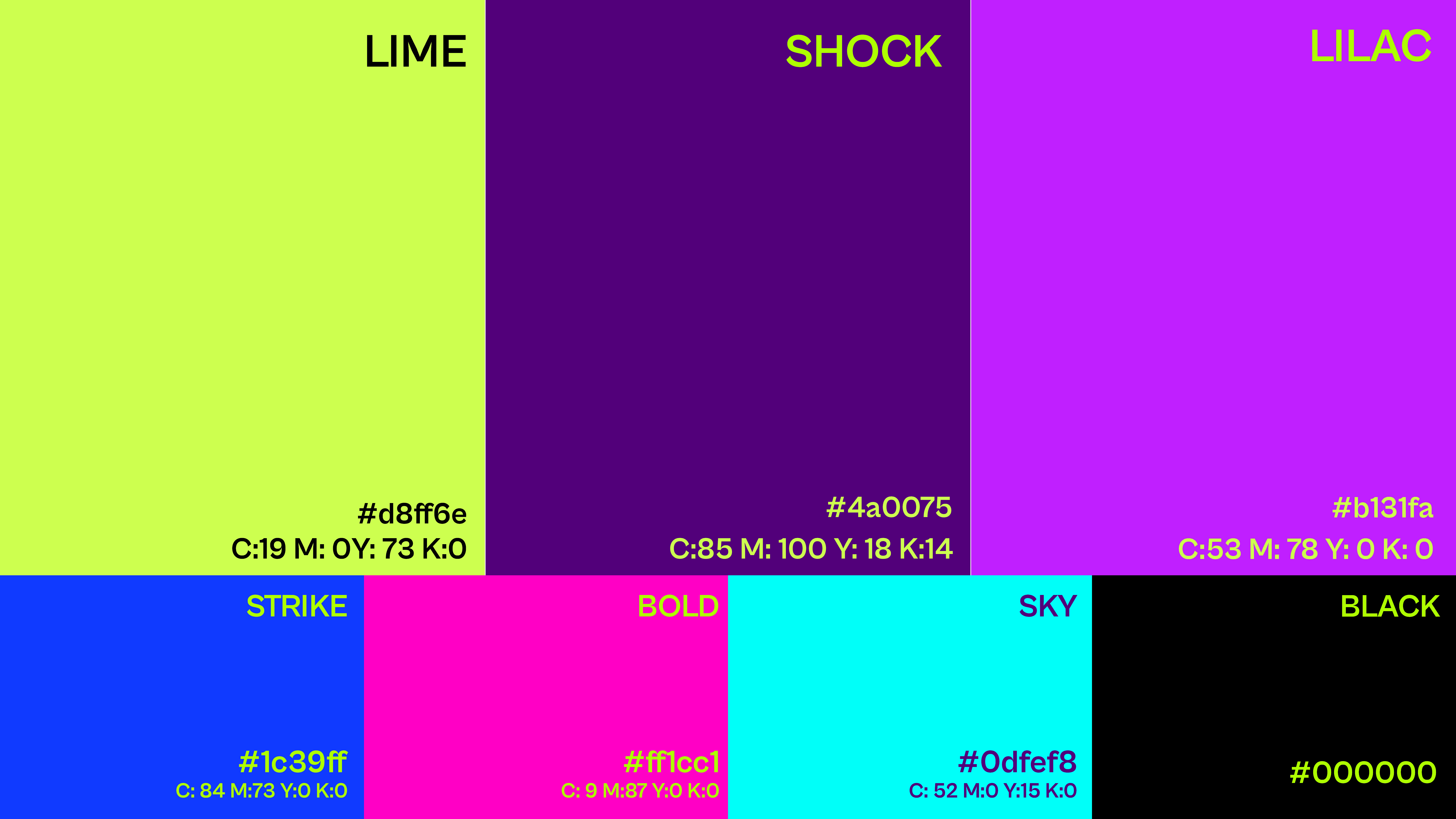
The contrast between neon and dark is intentional - like a CRT monitor glowing, signal popping against the void. Playful enough to feel human and energetic. Bold enough to demand attention. It says: We don't hide complexity. We make it beautiful.
Typography
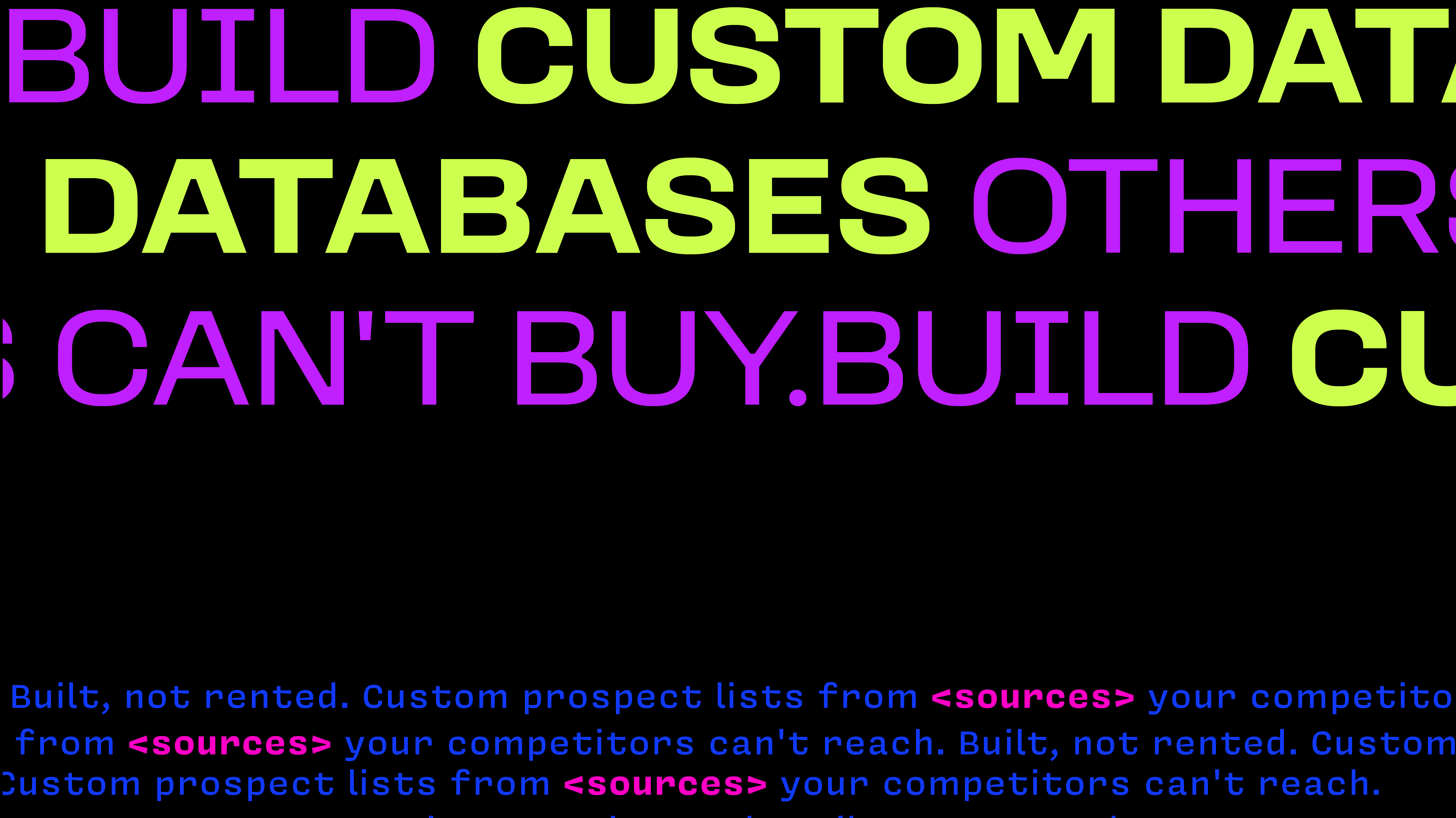
We paired Loos Wide - a bold, geometric grotesque typeface - for headlines, creating that confident, grid-like modular feel while maintaining sharp contemporary edges.
For body copy, we chose Covic Sans, a typewriter and pixel-style font that directly echoes retro computing aesthetics while remaining highly legible across 12+ scripts and languages.
One key decision: the monospace character of Covic Sans for data, tables, and prospect lists reinforces the idea that complexity is made readable through intentional curation - each character placed with purpose, like pixels on a screen.
Imagery & Iconography
We developed an icon system that moves away from abstract AI clichés and instead shows process: data flowing in, filters being applied, curated lists emerging, teams executing. Visual language rooted in the actual job Kuration does - turning noise into signal.
System & Flexibility
The brand works at scale. Website headers, LinkedIn carousels, prospect list templates, email campaigns, product UI tokens - each touchpoint reinforces the same conviction: raw data becomes custom advantage through intentional filtering.
Color
The color palette was the most important decision.
We developed a system built on high-contrast, intentional choices - inspired by how retro games used limited, vibrant palettes with maximum impact. No muted tones masking the boldness of the idea. Pure, purposeful, playful color.
Primary: Neon yellow and neon purple (the signal, the filtered pixels, the "aha moment")
Secondary: Electric blue, hot pink, and deep black (the grid, the structure, the contrast, the noise)
The contrast between neon and dark is intentional - like a CRT monitor glowing, signal popping against the void. Playful enough to feel human and energetic. Bold enough to demand attention. It says: We don't hide complexity. We make it beautiful.
Typography
We paired Loos Wide - a bold, geometric grotesque typeface - for headlines, creating that confident, grid-like modular feel while maintaining sharp contemporary edges.
For body copy, we chose Covic Sans, a typewriter and pixel-style font that directly echoes retro computing aesthetics while remaining highly legible across 12+ scripts and languages.
One key decision: the monospace character of Covic Sans for data, tables, and prospect lists reinforces the idea that complexity is made readable through intentional curation - each character placed with purpose, like pixels on a screen.
Imagery & Iconography
We developed an icon system that moves away from abstract AI clichés and instead shows process: data flowing in, filters being applied, curated lists emerging, teams executing. Visual language rooted in the actual job Kuration does - turning noise into signal.
System & Flexibility
The brand works at scale. Website headers, LinkedIn carousels, prospect list templates, email campaigns, product UI tokens - each touchpoint reinforces the same conviction: raw data becomes custom advantage through intentional filtering.


Impact
What we created is a brand that finally reflects what Kuration does.
It moves away from generic AI positioning and positions itself as a data curation platform - something that transforms raw information (noise) into actionable intelligence (signal) through intentional filtering and structure.
The identity feels modern and confident without chasing trends. It's playful (inspired by retro gaming logic) but rigorous (grid-based, modular, precise). Bold without being arrogant.
More importantly, it aligns perception with product. Investors now see the founder's vision reflected in the visual language. Customers immediately understand: This isn't about having more data. It's about having the right data.
The rebrand has shifted conversations:
Pitch meetings move faster (the visual language communicates "filtering expertise" before a word is spoken)
Customer acquisition cost dropped measurably (clearer positioning = better pre-sales fit)
Team confidence increased (employees feel authentic representing the brand)
Competitor comparisons shifted from "another database tool" to "entirely different category"
The product UI now feels cohesive with brand - data blocks, filtering layers, and curated lists speak the same visual language
What Kuration enables now is what they enabled before - but finally, the world sees it.
Key Takeaway
The strongest brands don't describe what a product does. They reflect what it enables.
Kuration doesn't enable "faster research." It enables turning noise into signal - filtering through markets competitors can't reach, curating lists built specifically for each team's advantage.
That conviction, clearly reflected in every visual touchpoint (data blocks, filtering language, modular system), is what separates the rebrand from the generic AI positioning it replaced.
It's the difference between owning a category and competing in one.
Impact
What we created is a brand that finally reflects what Kuration does.
It moves away from generic AI positioning and positions itself as a data curation platform - something that transforms raw information (noise) into actionable intelligence (signal) through intentional filtering and structure.
The identity feels modern and confident without chasing trends. It's playful (inspired by retro gaming logic) but rigorous (grid-based, modular, precise). Bold without being arrogant.
More importantly, it aligns perception with product. Investors now see the founder's vision reflected in the visual language. Customers immediately understand: This isn't about having more data. It's about having the right data.
The rebrand has shifted conversations:
Pitch meetings move faster (the visual language communicates "filtering expertise" before a word is spoken)
Customer acquisition cost dropped measurably (clearer positioning = better pre-sales fit)
Team confidence increased (employees feel authentic representing the brand)
Competitor comparisons shifted from "another database tool" to "entirely different category"
The product UI now feels cohesive with brand - data blocks, filtering layers, and curated lists speak the same visual language
What Kuration enables now is what they enabled before - but finally, the world sees it.
Key Takeaway
The strongest brands don't describe what a product does. They reflect what it enables.
Kuration doesn't enable "faster research." It enables turning noise into signal - filtering through markets competitors can't reach, curating lists built specifically for each team's advantage.
That conviction, clearly reflected in every visual touchpoint (data blocks, filtering language, modular system), is what separates the rebrand from the generic AI positioning it replaced.
It's the difference between owning a category and competing in one.
More Projects
More Projects
More Projects


Contact us
We love working with businesses of all shapes and sizes.
or write to us at enquire@manasidoshi.com



Contact us
We love working with businesses of all shapes and sizes.
or write to us at enquire@manasidoshi.com
Contact us
We love working with businesses of all shapes and sizes.
or write to us at enquire@manasidoshi.com