Logo design for Real estate Saanidhya Developers in Ahmedabad
Saanidhya Developers - Brand Identity Design for Ahmedabad’s Prominent Real Estate Player
Client
Client

Saanidhya Developers

Saanidhya Developers

Agency

Agency

Studio Manasi Doshi

Studio Manasi Doshi

Year

Year

2024

2024

Role

Role

Brand Identity

Brand Identity

The Brief

In May 2024, we partnered with Ahmedabad-based Saanidhya Developers, an established firm crafting modern residential and commercial spaces - from malls and complexes to homes across price points. Rooted in "Saanidhya" (Gujarati for proximity—to home, values, loved ones), their portfolio serves diverse buyers. They wanted a scalable brand identity evoking trust, connection, and aspiration.

The Challenge

Balance modernity with warmth for a broad audience: first-time homebuyers to commercial investors. The identity needed to capture the essence of the name : emotional proximity, shelter, tradition and progress; while scaling cohesively across onground (hoardings, brochures) and digital (websites, banners) touchpoints in a competitive market.

The Process

Collaborated closely to distill Saanidhya's ethos into a versatile visual system, ensuring every element reinforces proximity and growth.
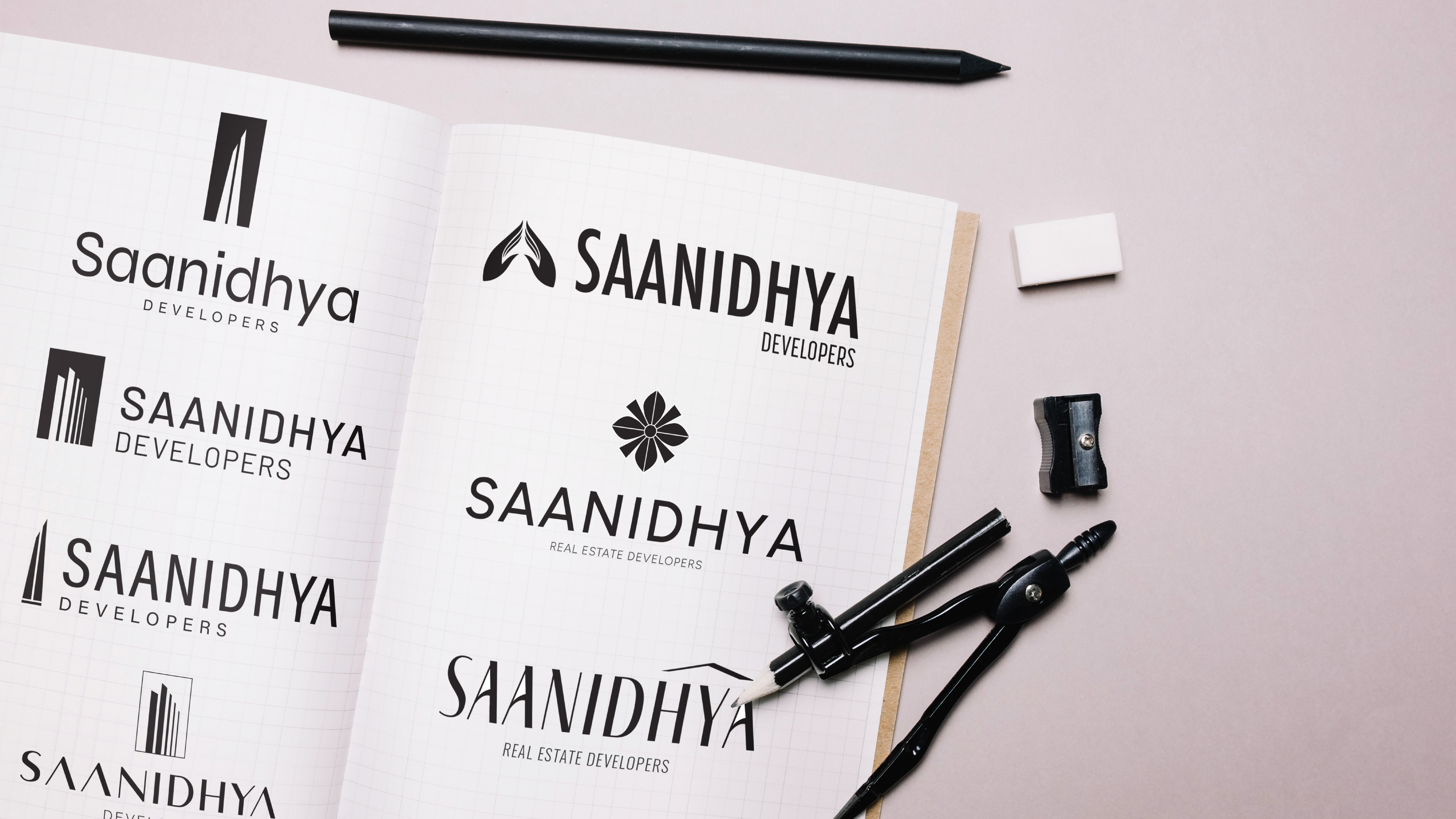

Saanidhya Real Estate Logo Explorations – Branding by Manasi Doshi

Logo and Core Symbolism: Designed a stylized roof, gently ascending to symbolize shelter, aspiration, and steady upward momentum - simple yet evocative of home and progress.


Logo grid for Real estate Saanidhya Developers in Ahmedabad


Outdoor hoarding mock up showing branding for Real estate Saanidhya Developers in Ahmedabad

The Brief

In May 2024, we partnered with Ahmedabad-based Saanidhya Developers, an established firm crafting modern residential and commercial spaces - from malls and complexes to homes across price points. Rooted in "Saanidhya" (Gujarati for proximity—to home, values, loved ones), their portfolio serves diverse buyers. They wanted a scalable brand identity evoking trust, connection, and aspiration.

The Challenge

Balance modernity with warmth for a broad audience: first-time homebuyers to commercial investors. The identity needed to capture the essence of the name : emotional proximity, shelter, tradition and progress; while scaling cohesively across onground (hoardings, brochures) and digital (websites, banners) touchpoints in a competitive market.

The Process

Collaborated closely to distill Saanidhya's ethos into a versatile visual system, ensuring every element reinforces proximity and growth.


Saanidhya Real Estate Logo Explorations – Branding by Manasi Doshi

Logo and Core Symbolism: Designed a stylized roof, gently ascending to symbolize shelter, aspiration, and steady upward momentum - simple yet evocative of home and progress.


Logo grid for Real estate Saanidhya Developers in Ahmedabad


Outdoor hoarding mock up showing branding for Real estate Saanidhya Developers in Ahmedabad

Color Palette: Anchored in sky blue for trust, clarity, and openness; layered with terracotta and warm beige for grounded luxury and tradition. This fresh-yet-rooted combination works well from premium commercial visuals to approachable residential marketing, evocating an emotion of comfort and luxury.

Colour Palette and branding for Real estate Saanidhya Developers in Ahmedabad

Scalable Visual Language: Built a cohesive system with refined typography (clean sans for modernity, subtle serifs for warmth), iconography of connected spaces (e.g., linked roofs, family silhouettes), and flexible layouts. Tested for applications like site hoardings, brochures, digital banners - ensuring consistency without rigidity.

Color Palette: Anchored in sky blue for trust, clarity, and openness; layered with terracotta and warm beige for grounded luxury and tradition. This fresh-yet-rooted combination works well from premium commercial visuals to approachable residential marketing, evocating an emotion of comfort and luxury.

Colour Palette and branding for Real estate Saanidhya Developers in Ahmedabad

Scalable Visual Language: Built a cohesive system with refined typography (clean sans for modernity, subtle serifs for warmth), iconography of connected spaces (e.g., linked roofs, family silhouettes), and flexible layouts. Tested for applications like site hoardings, brochures, digital banners - ensuring consistency without rigidity.

Branding for Real estate Saanidhya Developers in Ahmedabad
Stationery mock up showing branding for Real estate Saanidhya Developers in Ahmedabad
Branding for Real estate Saanidhya Developers in Ahmedabad
A warm, inviting space designed to reflect Saanidhya’s philosophy—homes to work in by day and unwind in by night—brought to life by Manasi Doshi’s campaign styling.
Folder mock up showing branding for Real estate Saanidhya Developers in Ahmedabad
Stationery mock up showing branding for Real estate Saanidhya Developers in Ahmedabad
Construction Site Branding for Saanidhya – Hoarding Design by Manasi Doshi
Brochure mock up showing branding for Real estate Saanidhya Developers in Ahmedabad
A striking billboard juxtaposing clear skies with bold structures captures Saanidhya’s essence—modern spaces rooted in tradition—visually curated by Manasi Doshi.
Signage mock up showing branding for Real estate Saanidhya Developers in Ahmedabad

Impact

Saanidhya's identity now radiates quiet assurance - modern, inclusive, and emotionally compelling - elevating their presence in Ahmedabad's real estate scene. It fosters deeper connections with diverse buyers, streamlines marketing across projects, and positions the brand as a beacon of tradition-meets-momentum for scalable growth.

Impact

Saanidhya's identity now radiates quiet assurance - modern, inclusive, and emotionally compelling - elevating their presence in Ahmedabad's real estate scene. It fosters deeper connections with diverse buyers, streamlines marketing across projects, and positions the brand as a beacon of tradition-meets-momentum for scalable growth.

More Projects

More Projects

More Projects

Nectadale | Brand Strategy & Identity for a D2C F&B Brand
Nectardale: Brand Strategy, Visual Identity and Packaging for a D2C Dry fruits brand from Jammu & Kashmir
Entios ai Logo
Entios.ai | Brand Identity Design for an American Start-Up building Agentic AI Tool for Marketing
Entios.ai - Brand Identity Design for a US based Agentic AI Tool for Marketing
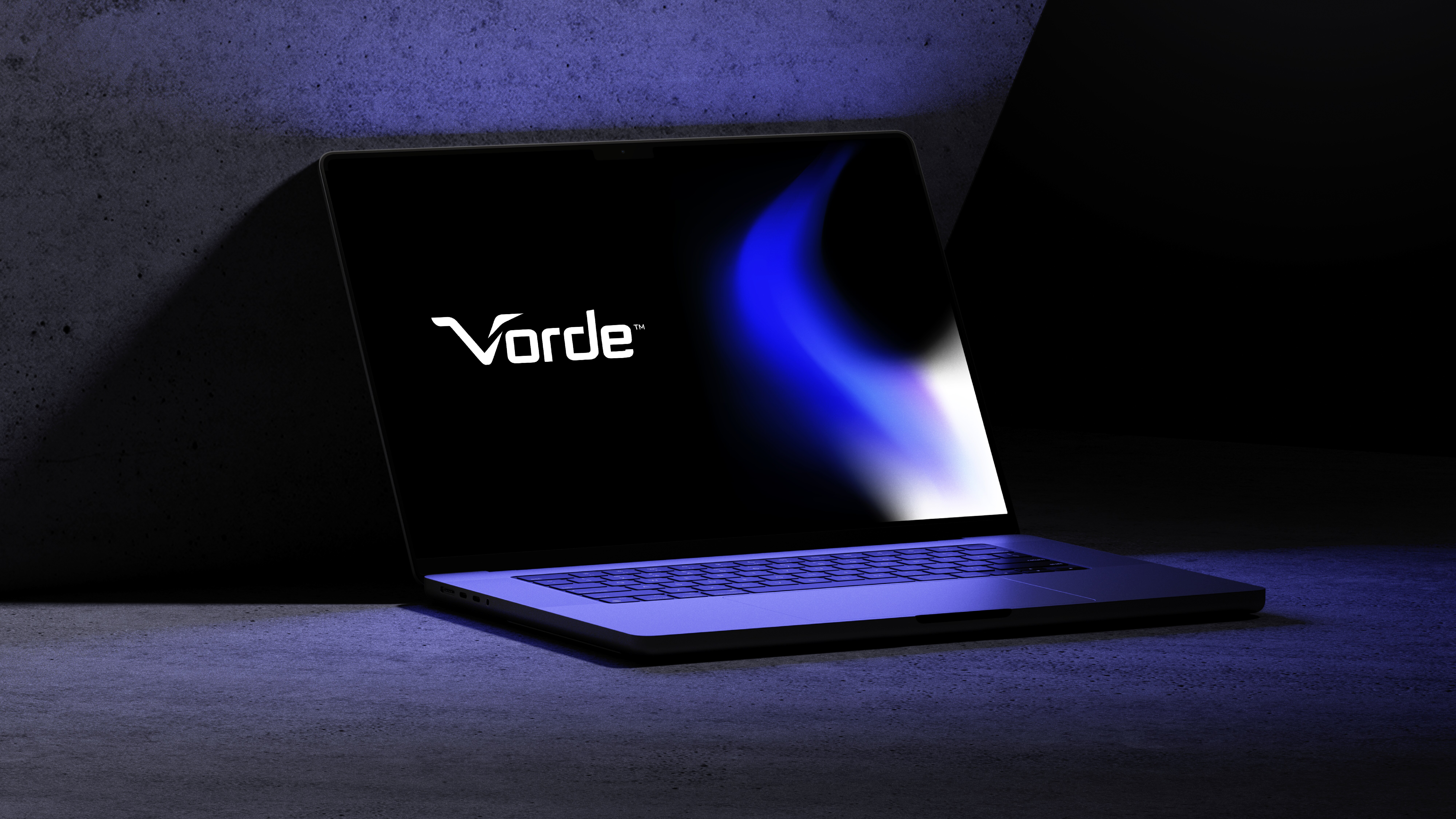
A laptop showcasing the word "Vorde" against a blue and black screen sits gracefully in Manasi Doshi's studio, its sleek design contrasting with a concrete backdrop.
Vorde | Branding and Web Design for B2C Consumer Electronics Brand in India

Contact us

We love working with businesses of all shapes and sizes.

or write to us at enquire@manasidoshi.com

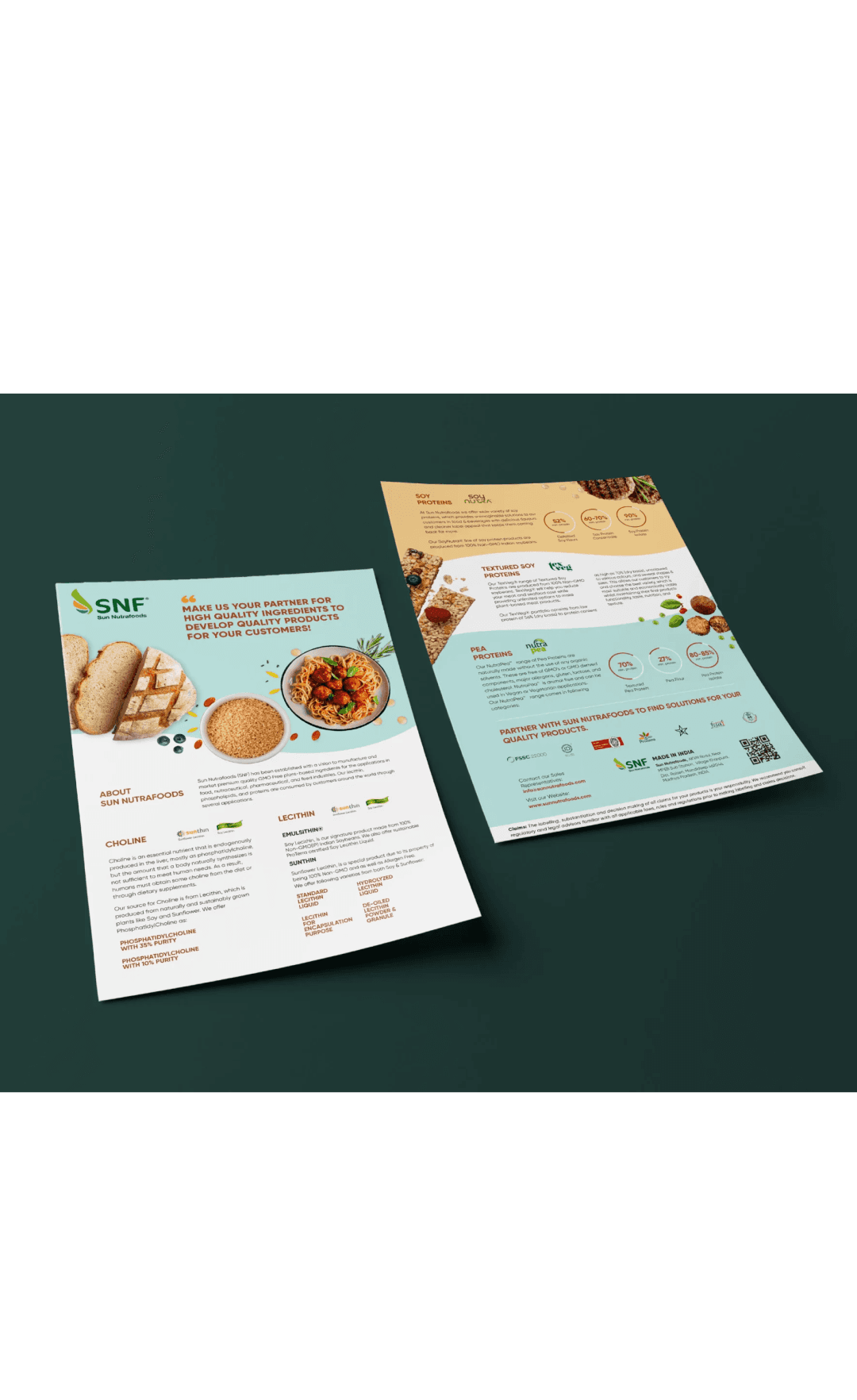
  • A bi-fold brochure featuring pea protein information, nutritional benefits, and applications, alongside vibrant green peas and pea products.
    Packaging design for Savon Artisanal Bathing Products by Studio Manasi Doshi
    Two packages of Nutty Gritties dried fruits: cranberries in red and blueberries in blue, displayed on light beige pedestals.
    packaging for Leons
    SAR website design on mobile screen with a person interacting with the mobile
  • A bi-fold brochure featuring pea protein information, nutritional benefits, and applications, alongside vibrant green peas and pea products.
    Packaging design for Savon Artisanal Bathing Products by Studio Manasi Doshi
    Two packages of Nutty Gritties dried fruits: cranberries in red and blueberries in blue, displayed on light beige pedestals.
    packaging for Leons
    SAR website design on mobile screen with a person interacting with the mobile

Contact us

We love working with businesses of all shapes and sizes.

or write to us at enquire@manasidoshi.com
Contact us

We love working with businesses of all shapes and sizes.

or write to us at enquire@manasidoshi.com

  • A bi-fold brochure featuring pea protein information, nutritional benefits, and applications, alongside vibrant green peas and pea products.
    Packaging design for Savon Artisanal Bathing Products by Studio Manasi Doshi
    Two packages of Nutty Gritties dried fruits: cranberries in red and blueberries in blue, displayed on light beige pedestals.
    packaging for Leons
    SAR website design on mobile screen with a person interacting with the mobile
  • A bi-fold brochure featuring pea protein information, nutritional benefits, and applications, alongside vibrant green peas and pea products.
    Packaging design for Savon Artisanal Bathing Products by Studio Manasi Doshi
    Two packages of Nutty Gritties dried fruits: cranberries in red and blueberries in blue, displayed on light beige pedestals.
    packaging for Leons
    SAR website design on mobile screen with a person interacting with the mobile