Is Your F&B Brand Actually Strong? Part 1: The Recognition Problem
Branding for Food & Beverage
3 min read
I've been thinking about F&B branding a lot lately.
There are just so many food and beverage brands now.
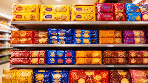
Walk into a supermarket and you'll find shelves full of beautifully designed packaging. Open Instagram and there’s another coffee brand, another snack brand, another D2C food company with a perfectly art-directed feed.
Everything looks good.
And somehow, a lot of it looks the same.
That's what I've been noticing.
We have become very good at making brands look good.
I'm not sure we've become equally good at making them memorable.
A food brand can have a beautiful logo, great photography, carefully chosen colors and a very polished Instagram feed—and still be completely forgettable.
Which made me wonder:
What actually makes an F&B brand strong?
I started with a simple test.
Remove the logo.
Take your packaging and hide the logo.
Would someone who already knows your brand still recognize it?
If the answer is no, that's interesting.
Because a logo is only one part of a brand identity.
The strongest F&B brands build recognition through a combination of things: color, typography, imagery, illustration, packaging structure, language, even the way information is arranged.
You should be able to remove one element without making the entire brand disappear.
Then I started thinking about another test.
Put your brand next to ten competitors.
Not alone on a presentation slide.
Actually next to them.
Ten snack brands. Ten coffee brands. Ten chocolate brands.
Suddenly, the differences can become surprisingly small.
Muted colors.
Minimal layouts.
Serif typography.
Beautiful food photography.
“Crafted.”
“Natural.”
“Premium.”
“Authentic.”
None of these things are wrong.
But when everyone speaks the same visual language, looking good stops being a differentiator.
And that's the interesting problem with F&B branding today.
We're designing brands in isolation when customers experience them in context.
They see your product between 20 others on a shelf.
They see your Instagram post between 30 other posts.
They see your restaurant on a delivery app alongside dozens of alternatives.
You don't get to control the environment.
So the real question isn't:
“Does my brand look good?”
It's:
“Would someone recognize me when I'm surrounded by everyone else?”
I'm starting to think that's a much better measure of strong branding.
And perhaps the next question is even harder:
Once they recognize you, do they know why they should choose you?
That's where I'll go next.
Continue to Part 2: The Differentiation Problem →
Work with Studio Manasi Doshi →