I went to Anuga FoodTec 2026 expecting to look at food technology. I came back thinking about branding.
Because the first thing you realise at a show like this is just how enormous the food and beverage industry really is. It is not only the packet you pick up from a supermarket shelf. It is processing, packaging, automation, warehousing, cold chains, logistics, safety, analytics, ingredients, manufacturing, wholesale and retail — an entire ecosystem working behind what eventually reaches the consumer. Anuga FoodTec itself is divided across automation and digitalisation, food processing, food packaging, intralogistics, safety and analytics, environment and energy. This year, the India edition brought together exhibitors from more than 30 countries.
And somewhere between the machinery and the food brands, I started noticing something else.
The international brands looked different.
Not necessarily louder. Not necessarily bigger. In fact, some of the most memorable stalls were remarkably restrained. Germany had a dedicated pavilion, with companies such as Krombacher International, Paul Reber, iprona, Peter Herres and Wiesenhof presenting together under the larger “Made in Germany” identity. Brazil, Italy, South Korea, Turkey, Spain and several other countries had their own country-led presence as well.
What struck me was how little they seemed to be trying to say.
Often there were just one or two people at a stall — a founder, a sales person, perhaps someone from the company — and yet you immediately understood what business they were in. They were well presented, articulate, specific about their niche and, importantly, they seemed to know that every interaction was part of how their company would be remembered.
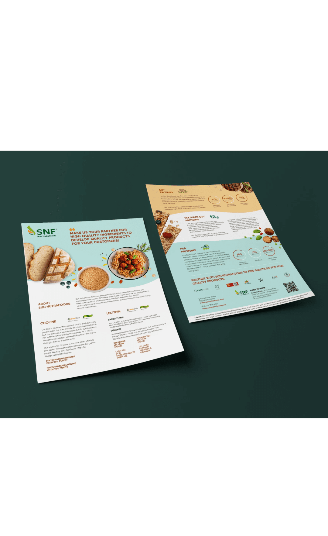
The brochures were consistent with the stalls. The packaging was consistent with the brochures. The people were consistent with the brand.
There was very little translation required.
On the Indian side, the picture was more mixed. There were certainly sophisticated, well-established companies present — names such as Bühler India, Krones Processing India, Nichrome, Knack Packaging, ABB India and others are part of a serious and increasingly capable food-processing ecosystem. But outside the larger, established players, I often found the experience more fragmented: crowded stalls, multiple messages, too many products competing for attention and a strong emphasis on making a sale.
This is, of course, an observation from one exhibition, not a verdict on Indian F&B as a whole.
But it made me wonder whether we are building businesses faster than we are building brands.
The numbers suggest that India has very little reason to think small. The Indian food-processing market reached an estimated US382billioninFY2025andisprojectedtoreachaboutUS689 billion by FY2034. Food processing already accounts for roughly 32% of India's total food market, while processed food made up around 20.4% of agricultural exports in FY2024–25.
The industry is growing. Investment is growing. Manufacturing capability is growing. Export ambition is growing.
So why does the brand experience sometimes still feel like it is catching up?
Perhaps because we still tend to think of branding as something that happens after the business has been built — the logo, the brochure, the packaging, the stall, the website — rather than as the system that makes the business easier to understand and trust.
At Anuga, the brochure was not just a brochure. The person standing at the stall was not just a salesperson. The packaging was not just packaging. The exhibition stand was not just an exhibition stand.
Every one of those things answered the same question: Who are we, and why should you believe us?
That is where I think Indian F&B has an interesting distance to cover.
Not because Indian businesses lack scale, ambition or technical capability. Quite the opposite. The opportunity is to make the brand experience reflect the quality and ambition that already exists inside the business.
We don't need to make Indian brands look European. We don't need more beige packaging simply because it looks international. We need greater clarity — in what we stand for, who we serve, what we are known for and how consistently that comes through across every touchpoint.
Because the next phase of India's F&B story cannot only be about making more, selling more and exporting more.
It has to be about becoming recognisable, credible and memorable while doing it.
We have the factories. We have the products. We have the entrepreneurs. We have the market.
Now we need to build brands that look like they belong on the same global shelf.