Client
Client
SAR Logistics
SAR Logistics
Agency
Agency
Studio Manasi Doshi
Studio Manasi Doshi
Year
Year
2024
2024
Role
Role
Art Direction, Web Design
Art Direction, Web Design
The Brief
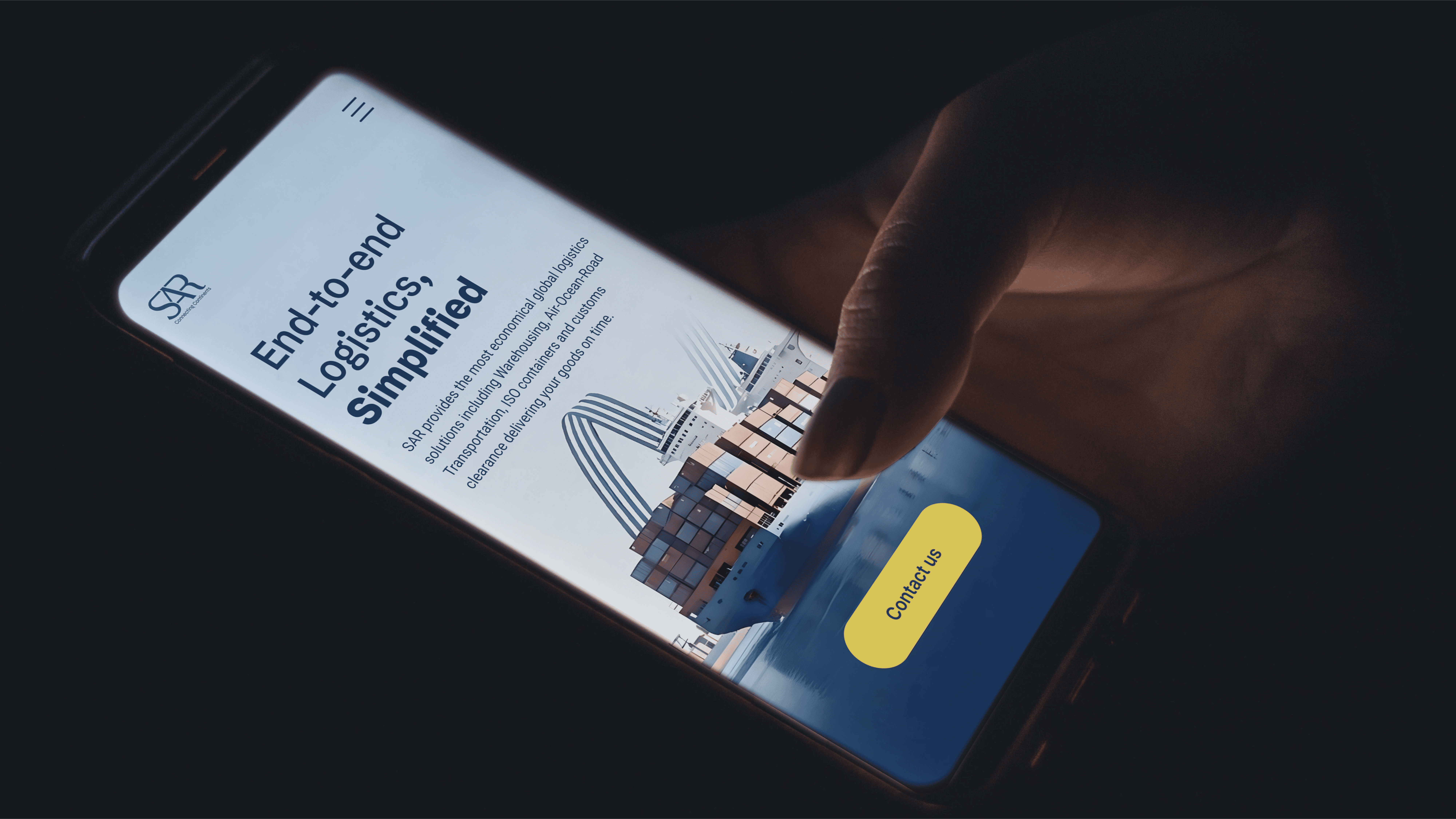
Founded in 2011 and Mumbai-headquartered, SAR Logistics delivers end-to-end solutions - freight forwarding, customs clearance, warehousing, and transportation - across industries. With a decade of expertise, they've earned trust as a supply chain partner. Their problem statement : “ Our website seems outdated. While we are a legacy brand, the outdated design and user experience doesn’t communicate our expertise and our competitors are doing it better. What can you do for it?”
The Challenge
As digital expectations surged, SAR's online brand lagged behind their real-world reliability. Visuals lacked clarity and consistency, failing to convey expertise amid competitors like Gati Limited, Blue Dart, Delhivery, Maersk and JCTrans.
The goal: Build a modern digital identity that positions SAR as knowledgeable, dependable, and agile - bridging mature experience with forward-thinking appeal.
The Process
We partnered closely with SAR's team for a strategic overhaul, turning audit insights into a cohesive visual and content system designed for long-term scalability.
Comprehensive Brand Audit: Analyzed SAR's existing communications and benchmarked against five key competitors (Gati Limited, Blue Dart, Delhivery, Maersk, JCTrans) plus global players. Pinpointed gaps in visual clarity while highlighting strengths in reliability and expertise.
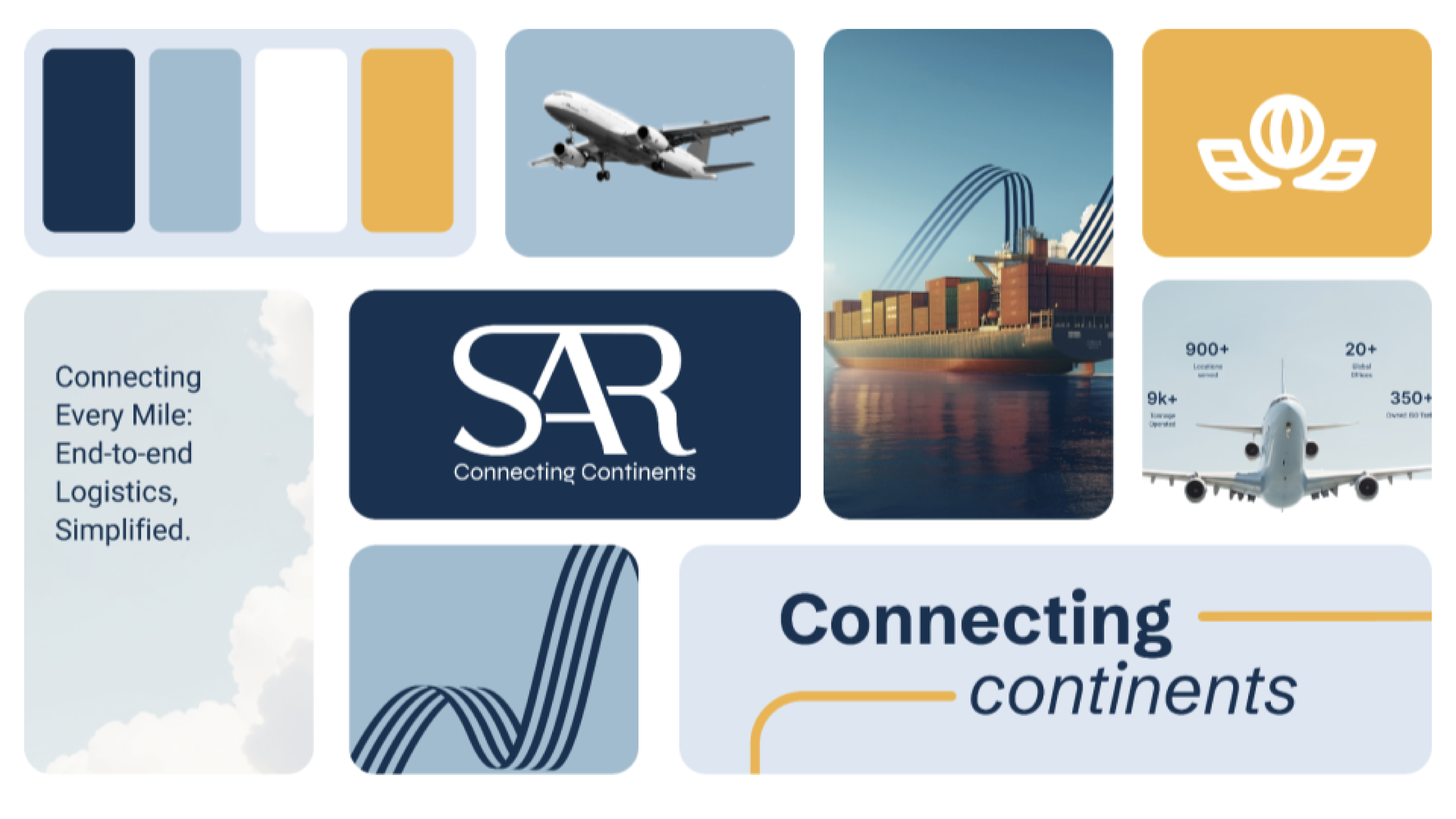
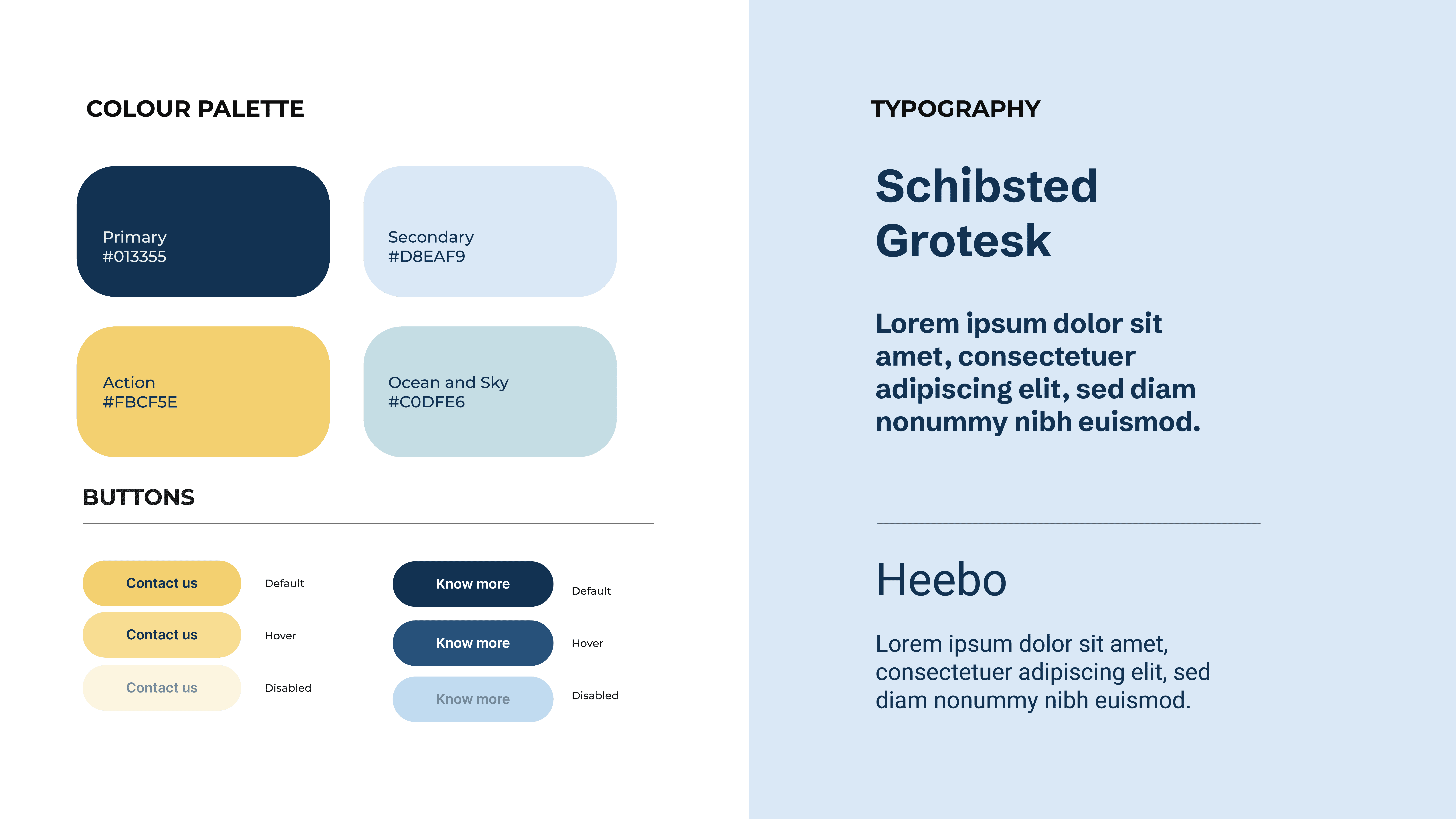
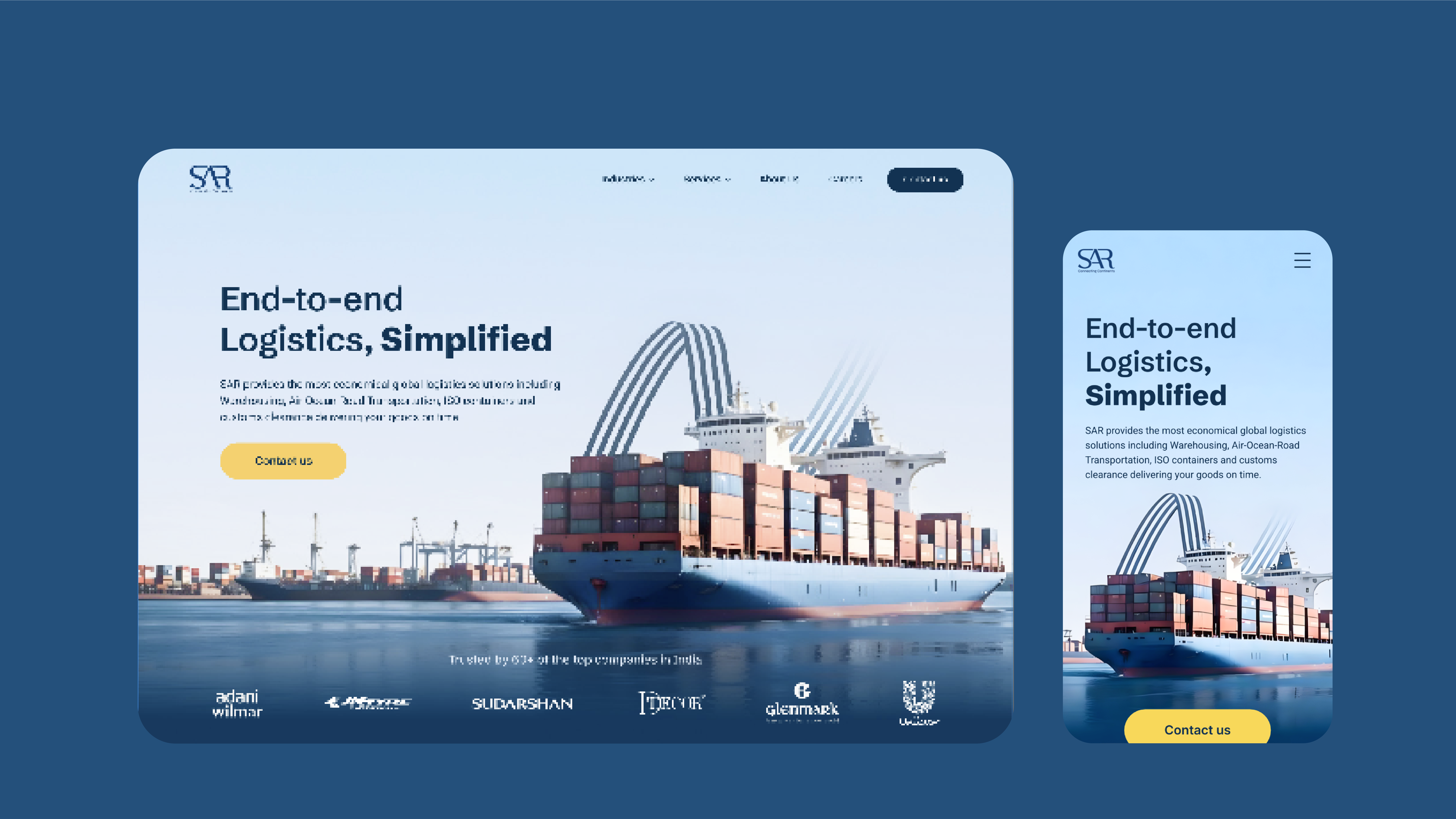
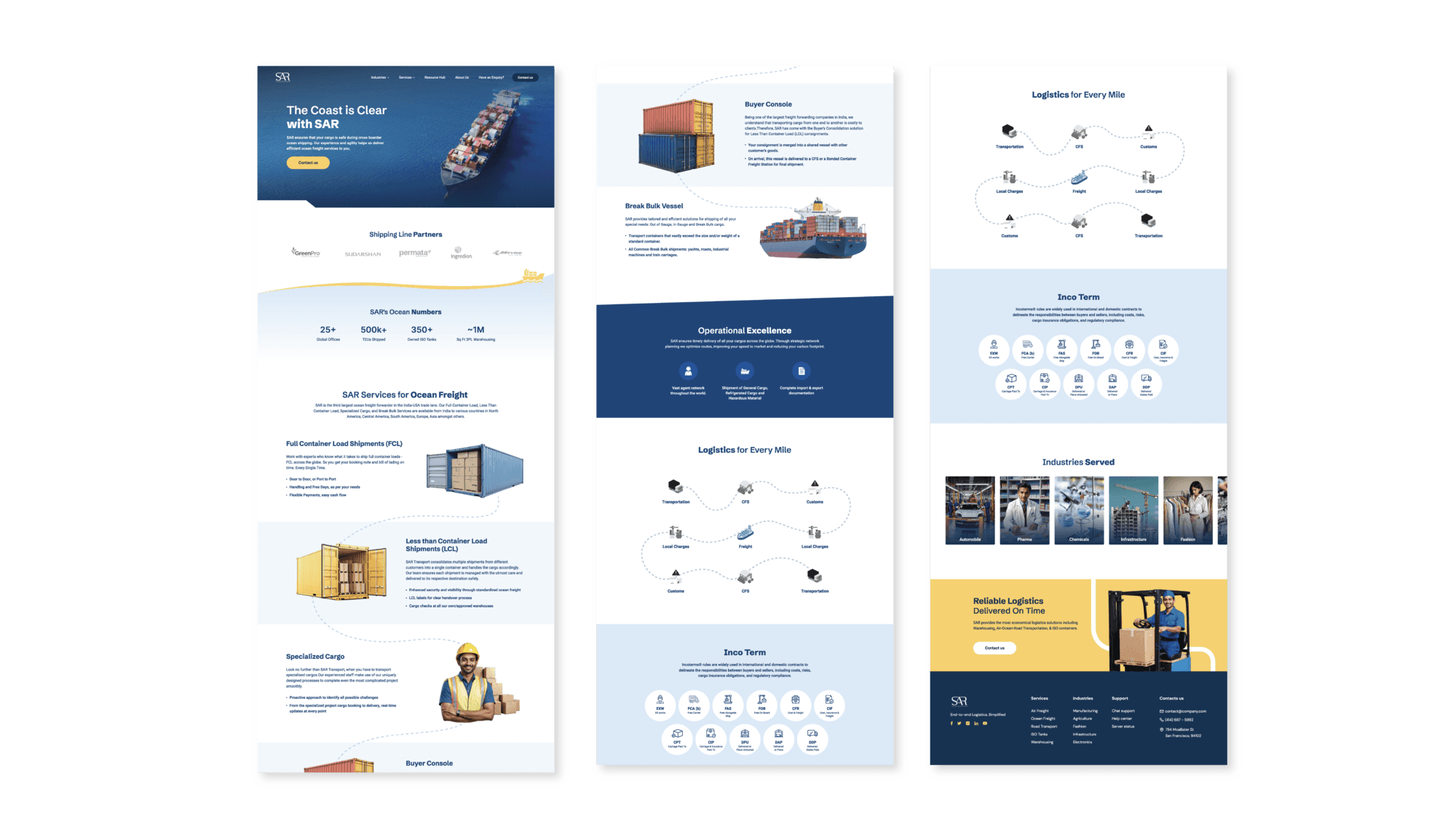
Visual Language Redesign: Crafted a modern palette of bold blues and neutrals for trust and efficiency; introduced clean 3D iconography depicting seamless flows (e.g., trucks, warehouses, global routes) with precise lines for precision and motion. Developed custom typography hierarchy using a sans-serif stack - strong headers for impact, legible body fonts for dense info like service details.
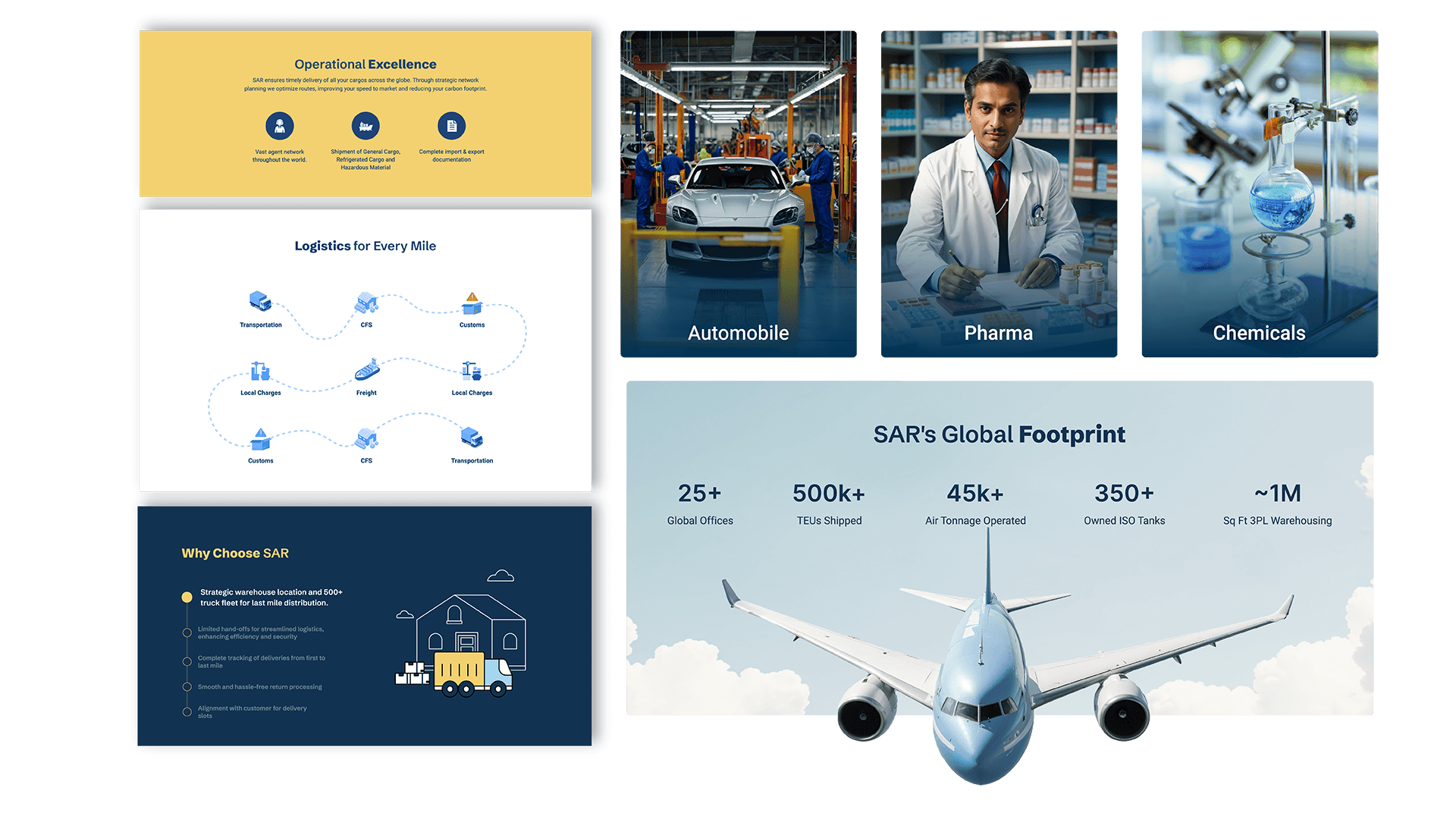
Content and Tone: Repositioned messaging as "efficient, expert-led end-to-end service." Refined hierarchy for websites/emails: Prioritized capability signals (e.g., case studies, certifications) with agile phrasing to appeal to B2B clients. Ensured every element—from icons to layouts - communicates clarity, confidence, and scalability across digital touchpoints.
Implementation and Testing:
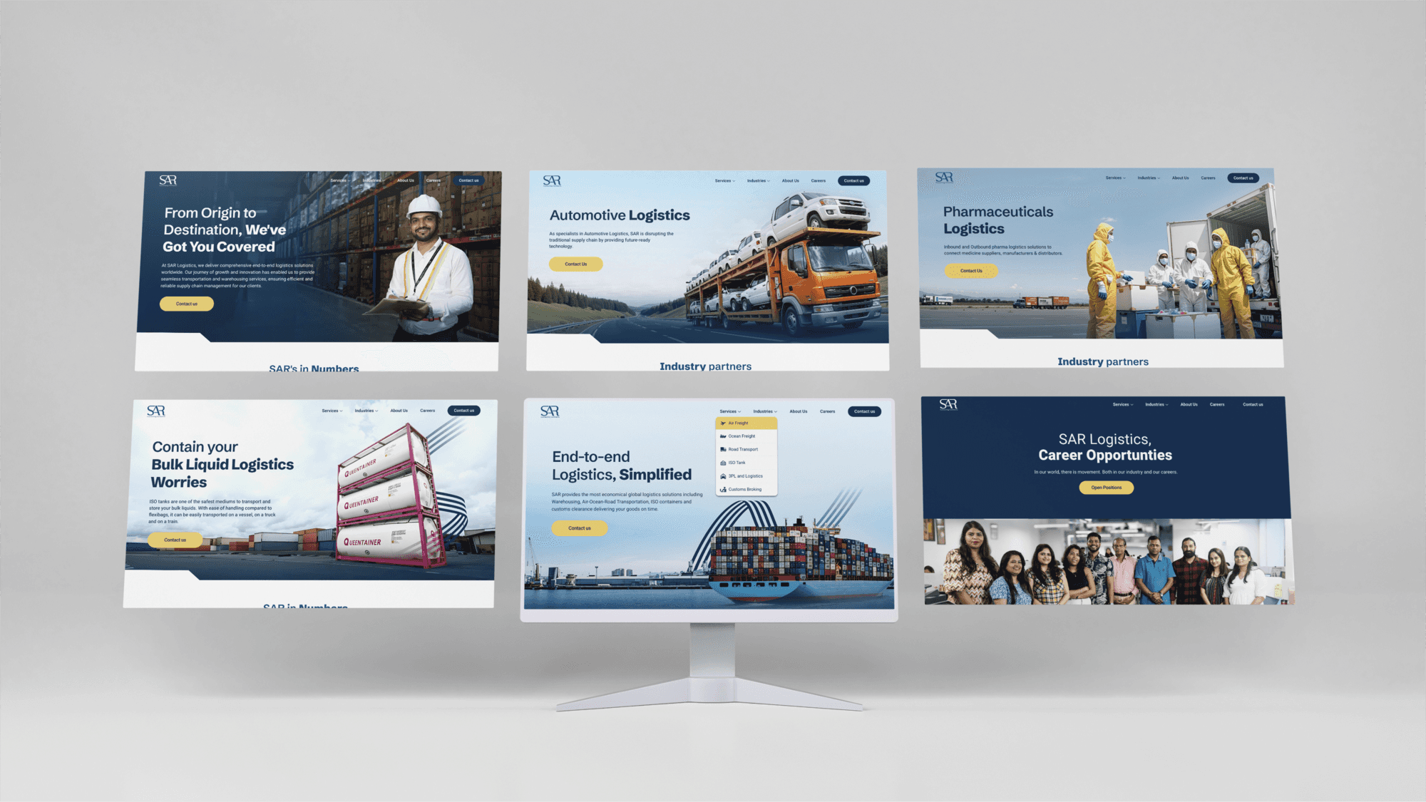
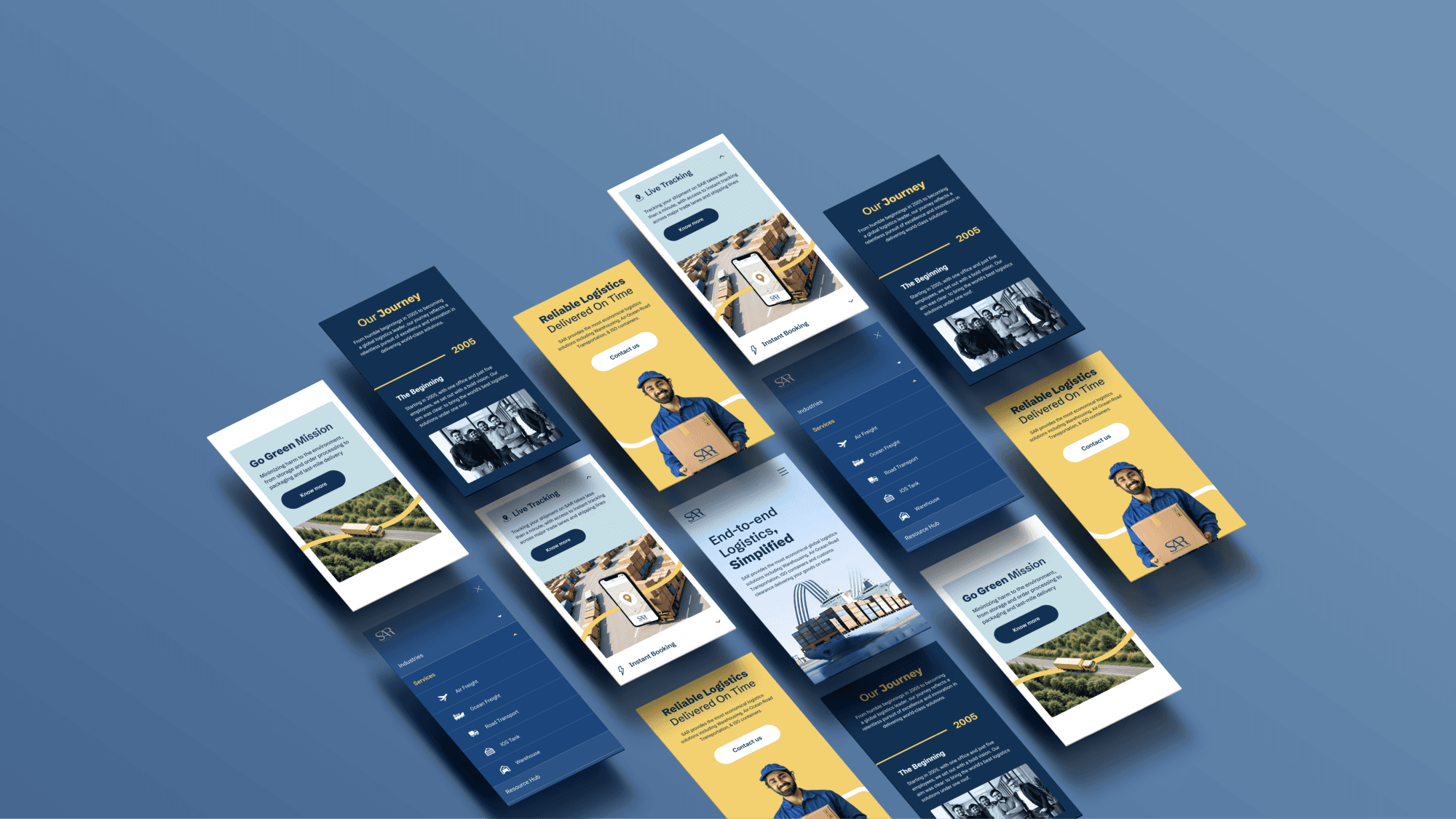
Rolled out a refreshed website based on team feedback for seamless adoption.
The Brief
Founded in 2011 and Mumbai-headquartered, SAR Logistics delivers end-to-end solutions - freight forwarding, customs clearance, warehousing, and transportation - across industries. With a decade of expertise, they've earned trust as a supply chain partner. Their problem statement : “ Our website seems outdated. While we are a legacy brand, the outdated design and user experience doesn’t communicate our expertise and our competitors are doing it better. What can you do for it?”
The Challenge
As digital expectations surged, SAR's online brand lagged behind their real-world reliability. Visuals lacked clarity and consistency, failing to convey expertise amid competitors like Gati Limited, Blue Dart, Delhivery, Maersk and JCTrans.
The goal: Build a modern digital identity that positions SAR as knowledgeable, dependable, and agile - bridging mature experience with forward-thinking appeal.
The Process
We partnered closely with SAR's team for a strategic overhaul, turning audit insights into a cohesive visual and content system designed for long-term scalability.
Comprehensive Brand Audit: Analyzed SAR's existing communications and benchmarked against five key competitors (Gati Limited, Blue Dart, Delhivery, Maersk, JCTrans) plus global players. Pinpointed gaps in visual clarity while highlighting strengths in reliability and expertise.
Visual Language Redesign: Crafted a modern palette of bold blues and neutrals for trust and efficiency; introduced clean 3D iconography depicting seamless flows (e.g., trucks, warehouses, global routes) with precise lines for precision and motion. Developed custom typography hierarchy using a sans-serif stack - strong headers for impact, legible body fonts for dense info like service details.
Content and Tone: Repositioned messaging as "efficient, expert-led end-to-end service." Refined hierarchy for websites/emails: Prioritized capability signals (e.g., case studies, certifications) with agile phrasing to appeal to B2B clients. Ensured every element—from icons to layouts - communicates clarity, confidence, and scalability across digital touchpoints.
Implementation and Testing:
Rolled out a refreshed website based on team feedback for seamless adoption.
Scroll through for snapshots of the process and a closer look at how we brought the brand to life.
Scroll through for snapshots of the process and a closer look at how we brought the brand to life.
Impact :
SAR's digital presence now mirrors their operational prowess - modern, consistent, and confidence-inspiring. The brand feels agile yet authoritative, driving better client engagement and positioning them as a go-to for scalable supply chains. Founders gain a blueprint for digital evolution without losing hard-earned credibility.
Impact :
SAR's digital presence now mirrors their operational prowess - modern, consistent, and confidence-inspiring. The brand feels agile yet authoritative, driving better client engagement and positioning them as a go-to for scalable supply chains. Founders gain a blueprint for digital evolution without losing hard-earned credibility.
More Projects
More Projects
More Projects
Contact us
We love working with businesses of all shapes and sizes.
or write to us at enquire@manasidoshi.com



Contact us
We love working with businesses of all shapes and sizes.
or write to us at enquire@manasidoshi.com
Contact us
We love working with businesses of all shapes and sizes.
or write to us at enquire@manasidoshi.com